- Home
- Quizzes
- My Quiz Activity
- Newsletters
- Sports Betting
- MY FAVORITES
- Add Sports/Teams
- SPORTS
-
NFL
- NFL Home
- Arizona Cardinals
- Atlanta Falcons
- Baltimore Ravens
- Buffalo Bills
- Carolina Panthers
- Chicago Bears
- Cincinnati Bengals
- Cleveland Browns
- Dallas Cowboys
- Denver Broncos
- Detroit Lions
- Green Bay Packers
- Houston Texans
- Indianapolis Colts
- Jacksonville Jaguars
- Kansas City Chiefs
- Las Vegas Raiders
- Los Angeles Chargers
- Los Angeles Rams
- Miami Dolphins
- Minnesota Vikings
- New England Patriots
- New Orleans Saints
- New York Jets
- New York Giants
- Philadelphia Eagles
- Pittsburgh Steelers
- San Francisco 49ers
- Seattle Seahawks
- Tampa Bay Buccaneers
- Tennessee Titans
- Washington Commanders
-
MLB
- MLB Home
- Arizona Diamondbacks
- Atlanta Braves
- Baltimore Orioles
- Boston Red Sox
- Chicago White Sox
- Chicago Cubs
- Cincinnati Reds
- Cleveland Guardians
- Colorado Rockies
- Detroit Tigers
- Houston Astros
- Kansas City Royals
- Los Angeles Angels
- Los Angeles Dodgers
- Miami Marlins
- Milwaukee Brewers
- Minnesota Twins
- New York Yankees
- New York Mets
- Oakland Athletics
- Philadelphia Phillies
- Pittsburgh Pirates
- San Diego Padres
- San Francisco Giants
- Seattle Mariners
- St. Louis Cardinals
- Tampa Bay Rays
- Texas Rangers
- Toronto Blue Jays
- Washington Nationals
-
NBA
- NBA Home
- Atlanta Hawks
- Boston Celtics
- Brooklyn Nets
- Charlotte Hornets
- Chicago Bulls
- Cleveland Cavaliers
- Dallas Mavericks
- Denver Nuggets
- Detroit Pistons
- Golden State Warriors
- Houston Rockets
- Indiana Pacers
- Los Angeles Clippers
- Los Angeles Lakers
- Memphis Grizzlies
- Miami Heat
- Milwaukee Bucks
- Minnesota Timberwolves
- New Orleans Pelicans
- New York Knicks
- Oklahoma City Thunder
- Orlando Magic
- Philadelphia 76ers
- Phoenix Suns
- Portland Trail Blazers
- Sacramento Kings
- San Antonio Spurs
- Toronto Raptors
- Utah Jazz
- Washington Wizards
-
NHL
- NHL Home
- Anaheim Ducks
- Arizona Coyotes
- Boston Bruins
- Buffalo Sabres
- Calgary Flames
- Carolina Hurricanes
- Chicago Blackhawks
- Colorado Avalanche
- Columbus Blue Jackets
- Dallas Stars
- Detroit Red Wings
- Edmonton Oilers
- Florida Panthers
- Los Angeles Kings
- Minnesota Wild
- Montreal Canadiens
- Nashville Predators
- New Jersey Devils
- New York Islanders
- New York Rangers
- Ottawa Senators
- Philadelphia Flyers
- Pittsburgh Penguins
- San Jose Sharks
- Seattle Kraken
- St. Louis Blues
- Tampa Bay Lightning
- Toronto Maple Leafs
- Vancouver Canucks
- Vegas Golden Knights
- Washington Capitals
- Winnipeg Jets
- NCAAF
- NCAAM
- Boxing
- Entertainment
- Lifestyle
- Golf
- MMA
- Soccer
- Tennis
- Wrestling
- More Sports
- RESOURCES
- My Account
- YB on Facebook
- YB on Twitter
- YB on Flipboard
- Contact Us
- Privacy Policy
- Terms of Service
-


Follow Us


The best and worst uniform looks for every NFL team
Nearly a fourth of the NFL changed uniforms in 2020. That makes it as good of a time as any to revisit every team's best and worst looks in their respective histories. We're confining this to the Super Bowl era, when NFL fashion began to take off, but older designs worn by teams as throwbacks are included. The choices are specific, with the home or away uniform pictured being the pick for each franchise.
The best and worst uniform looks for every NFL team
NFL teams continue to change uniform schemes, some for better and some for worse. Here is a look at each franchise's best and worst uniform decisions. We're confining this to the Super Bowl era, when NFL fashion began to take off, but older designs worn by teams as throwbacks are included. The choices are specific, with the home or away uniform pictured being the pick for each franchise.
Arizona Cardinals' best look: 1989-93 away
We start with the then-Phoenix Cardinals' white-on-red away attire. What bumps these over the Aeneas Williams-Jake Plummer-era home attire: the Arizona state flag on the sleeves. The Cards relocated from St. Louis in 1988 but did not use this wrinkle until '89. Featuring it for five seasons gave the team some additional flair. And let's face it: The Cardinals of the '90s wore some pretty basic home uniforms. Rod Tidwell did spend most of "Jerry Maguire" in the reds, but mid-montage, there is a clip of the brooding wideout sprinting for a touchdown in the whites.
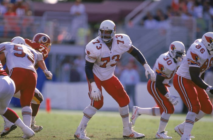
Arizona Cardinals' worst look: 2005-2022 away
The Cardinals ditched their longtime uniform in 2005, moving to a less timeless look. These stirrups, particularly displeasing on the team's road white-on-white design, have seen their time pass. It is unfortunate Larry Fitzgerald was required to wear these in all but one season of his Hall of Fame career. The random splash of red on the shoulder pads did not help Arizona's cause. The Kyler Murray era received its overdue rebrand, which unfortunately is monochrome-reliant, in 2023.
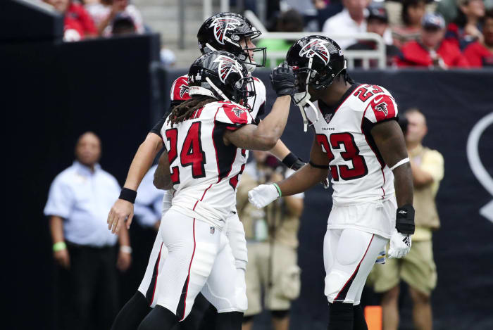
Atlanta Falcons' best look: 1978-89 home
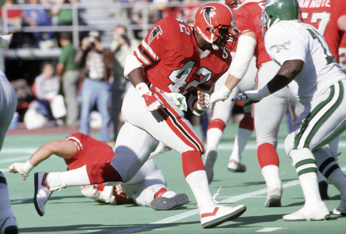
This is probably the dissenting opinion, but the Falcons looked sharp in their home reds of the 1980s. Before Atlanta went with its famed black-on-gray look upon black aficionado Jerry Glanville's 1990 arrival, its red-on-gray attire — complete with the black logo on the sleeves and a severely underrated helmet — flashed in one of the NFL's premier uniform eras. The Falcons not being especially good while wearing these unis should not detract from the design's place in history. It is unfortunate these threads haven't seen the light of day since 1989.
Atlanta Falcons' worst look: 2003-19 away
Atlanta's uniform timeline, and scheme, is close to Arizona's. The team appeared in Super Bowl XXXIII in its quality 1990s look and saw Michael Vick stun the Packers in the 2002 divisional round in that design. But in 2003 the Falcons introduced this concept. For road uniforms that have the team's colors thrown into random places, these are both unspectacular and unnecessarily complicated all at once. The jury is still out on the franchise's radical 2020 redesign, but they may represent a slight improvement on this bottom-tier road look.
Baltimore Ravens' best look: 2016-19, 2021-22 color rush
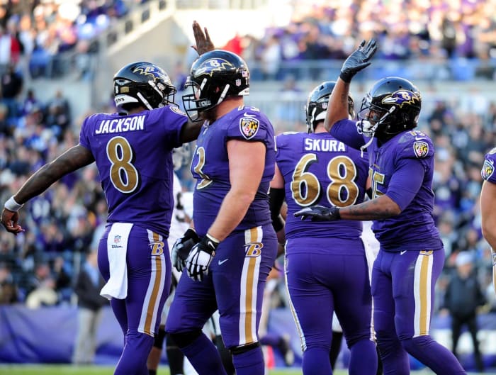
The gold in the Ravens' color scheme saw action in a memorable 2015 game (for uniform purposes) against the Chiefs, and while that did not go well , Baltimore's color rush attire made up for it. Purple is not the easiest color to make work, but the Ravens' est.-2016 purple (feat. gold) attire does. Ravens numbers have never looked better, and the team — armed with an MVP quarterback in Lamar Jackson — should consider pivoting to these full time over the slightly overrated Ray Lewis-era design. The team not wearing these in 2023 is concerning, however. A uniform subplot to monitor as we enter the mid-2020s.
Baltimore Ravens' worst look: 1996 home
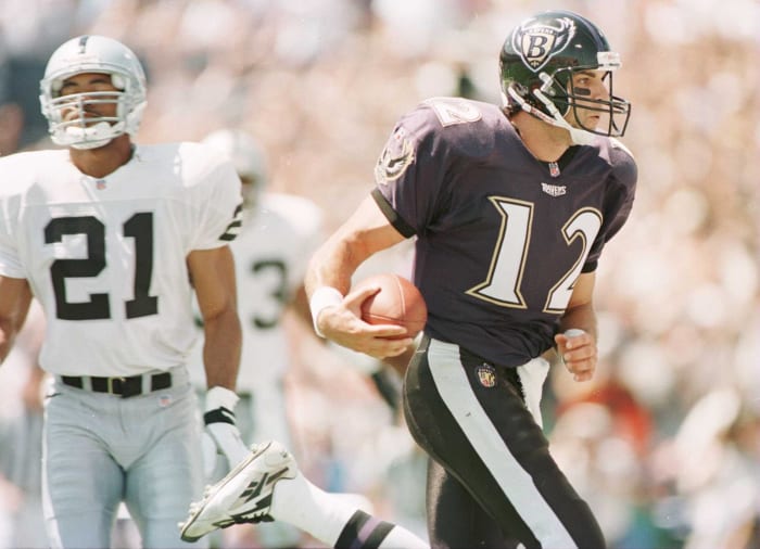
Whether the Ravens' current design is overrated or not, it was an upgrade from the team's Year 1 look. The contrast between uniforms in this photo is jarring, with the 1996 Ravens sporting bulky numbers and a purple jersey that did not match the home black pants. There's nothing wrong with the first Ravens logo, which the franchise kept for three seasons, but the team quickly realized these uniforms were a mistake. Baltimore moved closer to its modern design in 1997.
Buffalo Bills' best look: 2011-present home

After an unfortunate switch from their Bruce Smith-years uniforms in 2002, the Bills made a smart correction nine years later. Buffalo giving its 1970s design a modern touch quickly made uniform-appreciating folks forget about the aughts catastrophe. The Bills' 2010s home blues beat out the home kits of the franchise's 1990s glory years, and Buffalo's current alternate all-reds are not far off. The Bills playing in Orchard Park brings one of the best uniform presentations today's game offers.
Buffalo Bills' worst look: 2002-10 away
We come to one of the more regrettable fashion flips in NFL history. The Bills kept their Super Bowl helmet but placed it on top of a horrifying design. Other franchises were moving to darker blue at this time; both the Broncos and Seahawks did so. Neither of those teams' changes were upgrades, and the Bills forced Drew Bledsoe to wear truly terrible uniforms during his three-year stay. While the all-blue home look was bad, this bizarrely crafted away ensemble was worse. These reek of XFL 1.0. Thankfully, this is all in the past.
Carolina Panthers' best look: 1995-present home

Carolina surged out of the blocks with strong uniforms. The Panthers have not made major changes since debuting in 1995, and their traditional black-on-silver attire presents the team in the best light. The Broncos may have erred when they chose road whites in Super Bowl 50, doing so because of bad Super Bowl experiences in orange, but it allowed the Panthers to stand out (aesthetically speaking) that night. These still work fine for the 29th-year franchise.
Carolina Panthers' worst look: 2019 home alternate
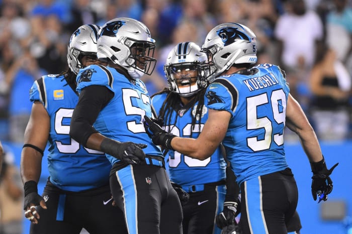
There isn't really a bad Panthers look, but we'll go with their blue-on-black alternates debuted during the 2018 preseason and in the regular season in 2019. The Panthers' blue-on-silver alternate, which was used from 2002-17, has a slight edge on these, as does Carolina's all-blue color rush kit. Donating this alternate home look to one of the NFL's current fashion-challenged franchises would be an upgrade, but the Panthers have a few better choices in their closet.
Chicago Bears' best look: 1974-present home

There's a reason the Bears have not tinkered with their look in generations. Other than experimenting with white-on-white at times, the Bears have worn a Mt. Rushmore NFL uniform since the orange "C" decal replaced the white logo in 1974. The simple blue-on-white home design has stood the test of time, being good enough for the likes of Walter Payton, Brian Urlacher and the Bears of today. The sleeve stripes were a bit more pronounced in the '80s, giving the version Chicago wore during its 1985 championship season a slight nod over its nearly identical modern attire.
Chicago Bears' worst look: 1994 throwback
The NFL's 100th season underwhelmed from a throwback standpoint in 2020, because for its 75th anniversary in 1994, the league devoted two full weeks to teams' fashion histories — good and bad. The Bears, in existence in their current city since 1922, were bound to veer toward "bad." Dusted off from the 1920s and early '30s, this Bears concept only surfaced once since the Herbert Hoover administration — the mandated September 1994 resurrection. Probably for the best.
Cincinnati Bengals' best look: 1981-96 home

Still the NFL's helmet kingpins, the Bengals peaked in uniform craftsmanship in the 1980s. The 1981 Bengals drew mockery for rolling out this then-radical look, but they made their first Super Bowl that year. From then until the early 2000s, this was Cincinnati's primary home uniform. Featuring top-shelf stripe commitment, the black-on-white home kits shined brightest with the orange socks used from 1981-96. It is understandable why the franchise changed themes in 2004, as the Bengals' on-field play cratered in the '90s and early 2000s. The Andy Dalton-era unis marked a step back, and the franchise has since pivoted again.
Cincinnati Bengals' worst look: 1968-80 away
The pre-1981 Bengals did not necessarily have bad uniforms; they just get docked for unoriginality. Fired from the Browns franchise he built, Paul Brown launched the Bengals in 1968 as part of the AFL. The uniforms bore a striking resemblance to the Browns', only with the western Ohio team using black instead of brown. The "BENGALS" helmets represented a slight deviation from the Browns' all-orange headgear, but when the then-AFC Central rivals played in the 1970s, the teams looked...similar.
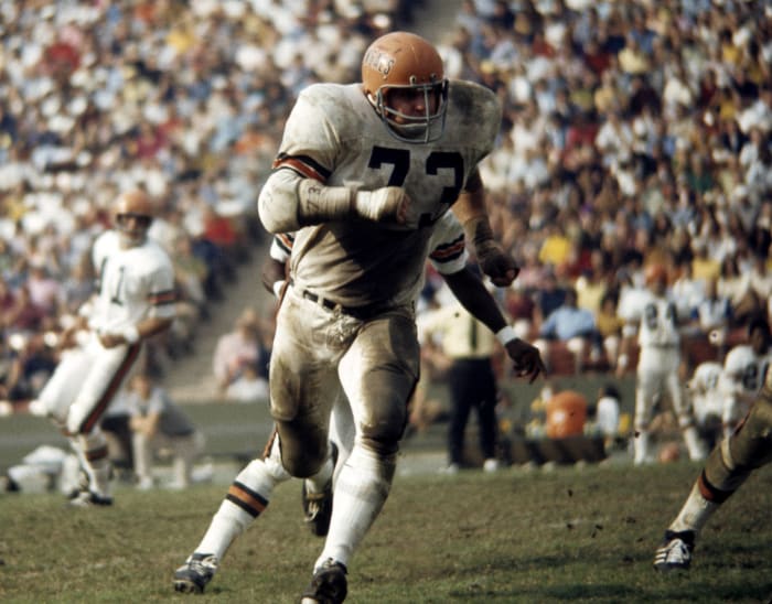
Cleveland Browns' best look: 1975-83, 2003-04, 2020-present home

A scheme the Browns debuted in 1975, the brown-on-orange look gets a little lost in this franchise's uniform history. The Brian Sipe-era Browns donned these often from 1975-83, before a strange "New Coke"-style 1984 adjustment that lasted one year. The franchise shelved its orange pants for a generation but resurrected them during the 2003-04 seasons and shined in their 2020 home opener, reintroducing them to a national audience in a Week 2 win over the Bengals. Four years since bringing these back, the Browns are off on the right foot following a five-year uniform mistake.
Cleveland Browns' worst look: 2015-19 brown-on-white

A concept so regrettable ownership started discussing a change quickly after its 2015 debut allowed the Browns to use a bevy of mostly unpleasant uniform combinations. The worst look comes when Myles Garrett and Co. suited up in brown tops and white pants. The vertical "BROWNS" print on the pants, along with the bulky numbers, leave this as a bleak period of Cleveland fashion. (Though, that did not stop Syracuse from trying out a spinoff.) Fortunately for the Browns, they pivoted back to a proven design scheme in 2020 and snapped an 18-year playoff drought immediately. Coincidence? Unlikely.
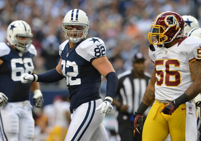
Dallas Cowboys' best look: 1964-present home white

No surprise here. Although the team's rarely used blue-on-silvers from the Triplets years did not receive their due, the Cowboys look best in the uniforms they choose to showcase in Dallas. While it would have been interesting had the Bills chosen to make the Cowboys wear their blues in one of the Super Bowls, thus puzzling fans around the world, these classic uniforms are associated with championship moments. Well, they were until the mid-1990s before some minor alterations (a slightly lighter shade of blue) commenced.
Dallas Cowboys' worst look: 2004-12 throwback blue
Although this list targets the Super Bowl era only, the Cowboys wearing these 1960-63 unis in Thanksgiving Day games this century makes them eligible. They are not as hideous as some of the other "worst" looks on this list, but the white helmets and bland blue tops dragged the Cowboys down a few notches when the team tried out this look.
Denver Broncos' best look: 1968-96 home
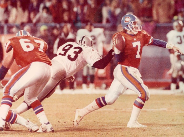
This is the only acceptable Broncos answer. While the Broncos' then-radical switch to the stirrup concept in 1997 produced back-to-back Super Bowls, they endured a significant aesthetic downgrade upon making that change. NFL orange peaked when the Broncos used these at Mile High Stadium for nearly 30 years. Current NFL throwback rules prohibit the Broncos from fully going back, but the now-orange-again franchise uses a full-orange color rush kit once a year. That Clemson-y look marks the closest the Broncos get to their uniform glory days.
Denver Broncos' worst look: 2009 away throwback
One of the more obvious picks on this list. Financial issues left the Broncos in this historically hideous, brown-and-yellow combination in their first two seasons. The team burned the unis in celebration upon securing its orange-and-blue scheme in 1962. But the AFL's 50th anniversary season brought them back. The yellow-on-brown design Denver deployed against New England in 2009 was so unusual it almost worked, making this "Monday Night Football" encore the choice. The Broncos were 2-0 in this color scheme and 6-8 in their usual attire that year, though.
Detroit Lions' best look: 1982-2001 home

Both the Lions' Barry Sanders-era uniforms worked well, but the edge goes to the blue-on-silver Silverdome attire. Although the franchise deserves credit for atoning for a bad decision in the 2000s, with Detroit's current look meriting "best" consideration, those cannot quite match the home kits of the '90s. Detroit's blue-on-silver (with white numbers) design flashed, and the initial part of Sanders' career doubled as the Lions' uniform apex. It was close between these and the franchise's three-year silver-numbered experiment (1979-81), but Sanders/Herman Moore years featured a cleaner look.
Detroit Lions' worst look: 2005-07 home alternate
As several teams have this century, Detroit shoehorned black into its color scheme in an early-21st century rebrand. The Lions mostly let black be an auxiliary color during this design's run from 2002-16, but on select occasions they chose to wear these. The Lions wore their alternate black tops five times from 2005-07. Thankfully, the experiment was shortlived.
Green Bay Packers' best look: 1961-present home

Although the Packers' road white-on-golds should not be slept on, the narrow edge here goes to the Lambeau Field (usually) uniforms. The Packers have used this green-gold concept since 1961, with the "G" making its debut on the franchise's helmets in the first of Vince Lombardi's five championship seasons. This remains one of the best uniforms in modern sports, and the fact the design is largely unchanged — save for some sock alterations and the team's logo adorning the sleeves in part of the '80s — quickly connects Bart Starr to Jordan Love..
Green Bay Packers' worst look: 2011 home throwback
The Packers have worn these jerseys more than once in the modern era, but this is one time a team and its fans benefited from rigid NFL uniform policies of recent years. Because teams were previously barred from deviating from their helmet color, this 2011 game marks the only time since the early 1930s brown helmets were part of this throwback package. This uniform surfaced during the Packers' 15-1 season, but thankfully the brown helmet vanished henceforth. Gold helmets were part of this scheme when the Packers used it in 2012 and '14.
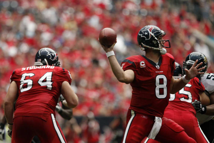
Houston Texans' best look: 2002-present away

The NFL's most recent expansion team did not opt for flash, which made for a nice shift from some of the league's other modern startups. Houston's away white-on-blues go well together, the blue pants matching the Texans' helmets and the red numbers providing a quality incorporation of the team's third color. These are fairly ordinary, but again, restraint is an underappreciated sports fashion trait.
Houston Texans' worst look: 2007-10 home alternate
But when overused, the Texans' red is a bit exposed. Of the teams that currently deploy some shade of red, the Texans' might be the worst. Not sure of the red threads' popularity in Houston, but this alternate full-red look does not put the team in its best light. When the Texans unleashed their all-red home scheme from 2007-10, it was a bit much. They doubled down on this approach when the NFL allowed for teams to use alternate helmets, greenlighting a redder Texans effort in 2023. This earlier experiment is not the worst NFL uniform by any means, but Houston flies too close to the sun when it veers too far toward its alternate color.
Indianapolis Colts' best look: 1987-94 home
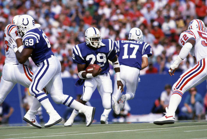
The Colts have not changed their uniform substantially in 62 years. When that's the case, details matter. The Colts went from gray to white to blue to gray facemasks. They have also minimized their hallmark shoulder stripes from the Johnny Unitas glory days. Here it will say the best blend came during the Eric Dickerson years, when the bulkier shoulder stripes remained and the white facemasks complemented the scheme better. We also cannot overlook the all-whites of this period, with the white facemasks accenting Indianapolis' road attire best.
Indianapolis Colts' worst look: 2004 away throwback

Although this space has made its stance known on forcing black into color schemes, the Colts' "Indiana Nights" look is not the pick here. Like some other pre-Super Bowl-era kits, the Colts' early- and mid-1950s uniform is grandfathered in because of the franchise's choice to wear it this century. There just isn't enough going on, with these Thanksgiving Day 2004 kits resembling a lighter-blue, mismatched Penn State. While moderation should be applauded in fashion, if it goes too far you're left with borderline practice jerseys.
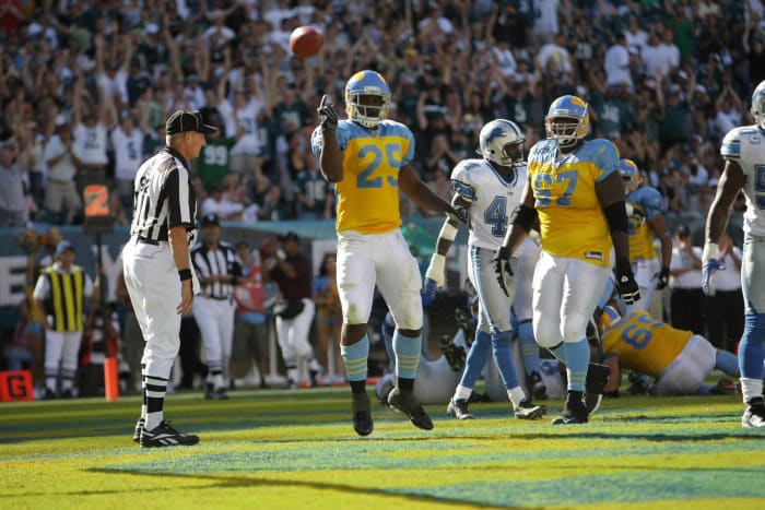
Jacksonville Jaguars' best look: 1995-2008 home
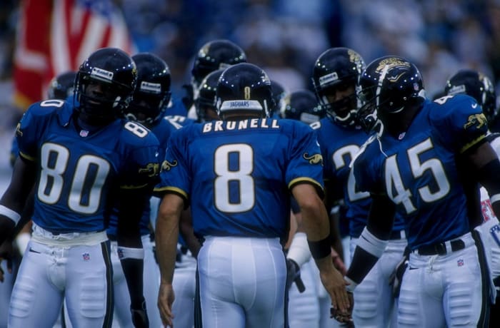
Jaguar uniforms did not always let us down. Their debut actually went pretty well. Coming along during a teal time in American sports, the Jaguars' 1995 teal home unis brought a nice change of pace for a league that had not seen many major attire adjustments in years. The large jaguar on the sleeves of these home kits cinched their place here, but honestly, there are a host of landmines in Jacksonville's fashion history. When the team ditched these in 2009, the floodgates opened.
Jacksonville Jaguars' worst look: 2017 home alternate
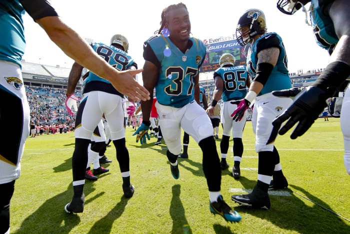
Arguments can be made for the team's black 2009-12 unis — before the two-toned helmet — and certainly the "Full Jaguar" experience from 2015 and '16 was considered. But this mismatch disaster, a one-time-only look in 2017, received the nod in perhaps the stiffest "worst" competition on this list. There is a random shape masquerading as pants art, a poor font choice and, of course, the unpopular two-toned helmet. The Jags ended their bold two-toned run after the '17 season, despite reaching the AFC championship game.
Kansas City Chiefs' best look: 1968-88, 2001-present away

While teams like the Bears and Packers are praised for their traditionalism, the Chiefs do not receive enough credit for design loyalty. They have used this uniform scheme since moving from Dallas to Kansas City in 1963. However, the Chiefs shine best when they break out their underrated red pants for road games. The Chiefs used red pants for much of their existence, but Marty Schottenheimer and successor Gunther Cunningham preferred a less pleasing white-on-white look that lasted 12 years. The Chiefs finally unveiled this uniform on a global stage in Super Bowl LVII.
Kansas City Chiefs' worst look: 2009 away throwback

Another grandfathered-in design, the Chiefs threw back to the Dallas Texans' original look during an AFL 50th anniversary game in 2009. These are obviously similar to the Chiefs' actual uniforms, but the Texas logo — and the all-white road attire — trail the handful of other options in the 62nd-year franchise's history. The two times in 2009 marked the only instances the Chiefs wore Dallas Texans gear since relocating.
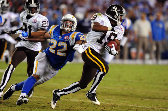
Los Angeles Chargers' best look: 2020-present home alternate
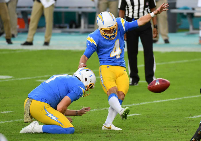
The Chargers wowed the uniform community in the 2020 offseason and then made made everyone wait until mid-November that year for their ballyhooed blue-on-gold look to surface. The Bolts wearing this exquisite combination only twice in 2020 brought cause for concern, but the team upped the usage to four times in the 2022 and '23 seasons. The Bolts' blue-on-whites rank highly among active uniforms, but the white pants should be kept in the closet. The modern Chargers may have a historically small fanbase, but they have a thoroughbred in their uniform stable that helps on this front.
Los Angeles Chargers' worst look: 2007-18 home
This might not be the absolute worst uniform in Charger history; a regrettable home one-off in 1967 is not a pleasant visual experience. But the home navy blue uniform is the Bolts' worst long-term decision. Abandoning the Junior Seau-era look for a much less appealing design, the Chargers then refused to give in to popular demand and make powder blue their primary color for 20 years to start the century. The team oddly ditched its best color after the 1973 season, and it took 46 years to return. A sad fashion story arc.
Los Angeles Rams' best look: 1973-99, 2018-19 home
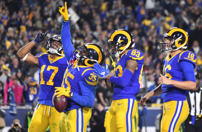
The dark blue-on-gold Edward Jones Dome look takes too much heat, but the Rams choice is not difficult. A team that lacked footing early in its Los Angeles 2.0 run smartly dusted these off. This near-perfect uniform was probably the best thing about Super Bowl LIII (narrowly edging the punting mastery). The modern Rams only gave us this gift for two years, however. Their chic 2020 update, unfortunately, brought a steep downgrade.
Los Angeles Rams' worst look: 2017-19 away
On the other hand, the new Rams away-from-L.A. uniforms are still an upgrade from their mess of a road design in the pre-SoFi era. The franchise brought back the super-retro white-ram helmets a year after relocating from St. Louis, but NFL rules stuck them with uniforms meant for the dark-gold ram that adorned the franchise's helmet from 2000-16. The result: an amazing disaster that tested uniform buffs' commitment every time the Rams wore white from 2017-19. The team even wore these at the L.A. Coliseum from time to time; a borderline betrayal.
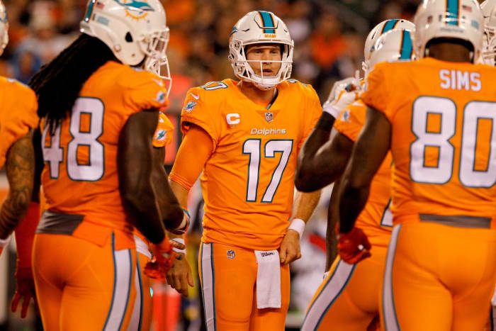
Miami Dolphins' best look: 1987-96 home

The Dolphins have gone through stages of aqua. This one, used from 1987-96, wins out. The aqua socks and sleeve logo give it a slight edge over the 1972 perfect-season attire. The Dolphins also broke out aqua pants on the road for the first time during this period. While those received strong consideration, the home aquas represent the team best. The current Dolphins using a throwback look always generates the most interest, with the franchise's past two design schemes trailing those of the 20th century.
Miami Dolphins' worst look: 2016 color rush
Not all Dolphins orange uniforms failed. The ones they wore occasionally in the 2000s were preferable to the color rush 2016 experiment. Not everyone can pull off orange, and the Dolphins' uniforms were a bad match for their helmets and ultimately ended as a misfire. They have not been worn since.
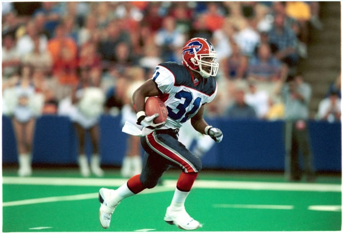
Minnesota Vikings' best look: 1969-95 away

One of the best stripe commitments in NFL uniform annals, the Vikings were a well-oiled operation when they packed their road whites for nearly 30 years. The Vikings' purples of this near-three-decade span cannot quite match their whites. Minnesota's purple helmet-purple numbers-purple socks trifecta supplied the right amount of this polarizing color, and the yellow stripe provides the clincher. It doesn't hurt that the Vikings wore these in several playoff games.
Minnesota Vikings' worst look: 2007-10 home alternate

Then we have the purple overdose. Brett Favre stopped by in the worst years for Viking uniforms, this stirrup-y scheme being used from 2006-12 (and never since). But two games stick out. In 2007 and in Favre's final season, 2010, Minnesota went Full Purple — only doing so with the goofy jersey stirrups that managed to not match the pants section of stirrup. Like Drew Bledsoe did in Buffalo, Favre went to Minnesota at the wrong time — from a fashion perspective.
New England Patriots' best look: 1984-92 home
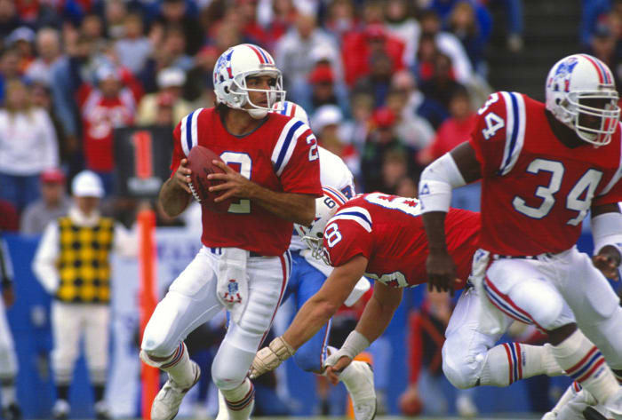
Pat the Patriot, a beloved emblem of a franchise that has risen to the NFL's mountaintop in much worse uniforms, is the surefire Patriots pick. While the unis worn during the bulk of Drew Bledsoe's tenure have also not resurfaced, the Pat kits have on a few occasions. New England's red-on-white look came off best with the vertical shoulder stripes of the 1980s and early '90s. The franchise abandoned Pat in 1993. NFL rules prevented the Patriots from going to their storied red-on-white look for many years, but once the league loosened regulations on helmet color, the team gave Pat a proper reintroduction — along with era-appropriate end zones — in 2022.
New England Patriots' worst look: 2020-present home

Although the Patriots' Tom Brady-era uniform was the most widely viewed attire in the NFL this century, with the franchise annually extending its seasons into late January and often February, it was neither impressive nor worthy of derision. But when the Pats chose to make their color rush look of recent years their standard attire post-Brady in 2020, it marked a fourth straight uniform downgrade for the franchise. This look accomplishes little. With the Patriots' best uniform work coming via contrast throughout eras, be it red-on-white or white-on-gray, the all-blue Patriots take a backseat.
New Orleans Saints' best look: 1967-69, 1996-98 away
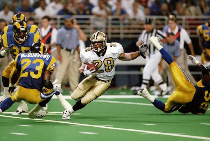
New Orleans' recent foray into throwback gold numbers represents an encouraging step for the franchise, but it comes with a caveat: the gold on the numbers does not match the helmet's gold. This has been a problem in Saints annals, but the team brings its best stuff when road gold emerges. That happened from 1996-98, and the Saints throwing in gold pants and gold numbers gives this otherwise unsuccessful period in team history the uniform nod.
New Orleans Saints' worst look: 1975-85 home

A regrettable Saints experiment with white pants and black jerseys earns this distinction. The Saints have used the black-on-black and black-on-gold combination since 1986, but in the 11 years prior, the franchise tried white pants at home. Archie Manning was forced to toil in this look for much of his career. Leaving gold pants on the shelf is unacceptable, especially when the team's original look included them.
New York Giants' best look: 1989-99 home

This section brings an interesting debate. Does the Giants' superior usage of red on their Eli Manning-era road uniforms outweigh the quality design scheme of the Bill Parcells years and beyond? While close, the attire the Giants brought to the Meadowlands in the late 1980s and throughout the '90s earns the slight nod. A subtle blue shift occurred in 1989, differentiating the team's Super Bowl XXI and XXV uniforms slightly. The lighter shade stayed in place for 11 seasons. New York's helmets of these years should not be overlooked either.
New York Giants' worst look: 1975 home

The bloated numbers and supersized sleeve stripes give this Giants uniform more than sufficient qualifications for the "worst" distinction, but the awful "NY" outline helmet logo provided a quality victory (defeat?) margin for worst Giants uniform of the Super Bowl era. The franchise quickly realized this mistake, scrapping that helmet after one season (1975).
New York Jets' best look: 1990-96 away
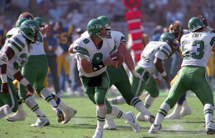
Moving to a lighter shade of green in 2019, the Jets harkened back to their days in between the Joe Namath look and the franchise's 1998 reversion to it. New York's first seasons with the "JETS" helmet logo — with the sublime jet component anchoring it on the helmet — featured a darker green, but in the late 1980s, the team moved to its optimal green tint. The Jets broke out green pants on the road for the first time in 1990. These, and the green numbers and sleeve stripes, stood out for this era and earn the pick here. Though, the team was 0-for-8 in playoff berths using this design. That undoubtedly led to the Jets dusting off their '80s white throwbacks for Aaron Rodgers' disastrous debut.
New York Jets' worst look: 2007-11 throwback

This space's issues with the current Jets' black pants aside, these grandfathered-in threads are the runaway victors for worst in team history. Used when the team was the New York Titans from 1960-62, these hideous uniforms made a brief comeback four times from 2007-11. Again, Brett Favre was caught in bad-uniform crosshairs, with one of this franchise's ill-fated throwback decisions coming during the quarterback's 2008 Jets cameo.
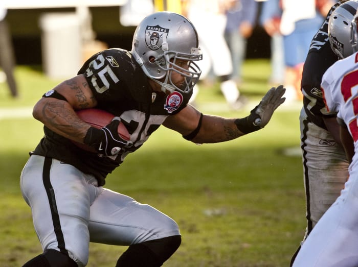
Oakland Raiders' best look: 2018-present away throwback

The Raiders used these on select occasions — in 1963, '64 and '70 — and dusted them off for one throwback weekend in 1994. It took until 2018 for the team to commit to this ensemble as its throwback look of choice. The Raiders have excellent standard home and away uniforms, but these slick, silver-numbered away kits — with the silver pants, which were not a part of the team's silver-numbered color rush uniform from 2016-17 — jump out so much they pull off a shocking upset here.
Oakland Raiders' worst look: 2009 home throwback
In the Super Bowl era, the Raiders do not have a bad uniform. (In the pre-Super Bowl period, they do, having used gold and black from 1960-62.) So these throwback helmets, worn twice during the AFL throwback season of 2009, not quite measuring up to the standard pirate logo will have to suffice. This being a team's worst modern uniform is quite the compliment.
Philadelphia Eagles' best look: 1985-95 home
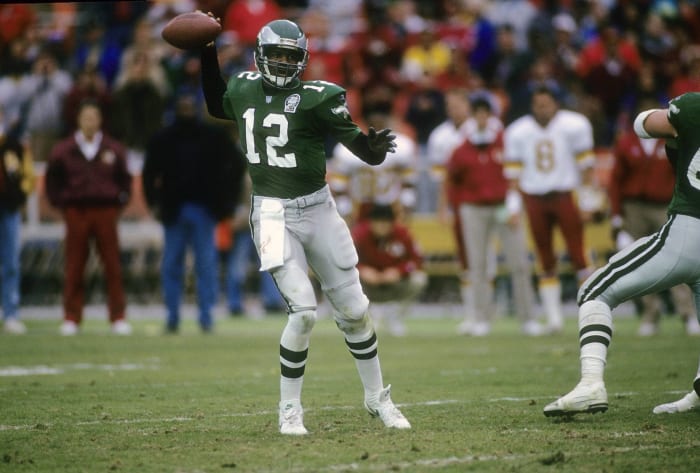
The uniforms the Eagles wore in Super Bowls XXXIX, LII and LVII work; they just do not pop compared to what the team once brought to the table. Switching to the Kelly Green scheme in 1985, Randall Cunningham's rookie year, the Eagles stayed committed to it for just 11 seasons — which bookended the quarterback's Philly run. Both the home and away uniforms would qualify for consideration, but the green-on-grays were one of the best looks in a stacked NFL uniform period. The Eagles have recognized this, having worn them as throwbacks on several occasions. Their popularity makes it confounding the Eagles have worn the blander green for nearly 30 years.
Philadelphia Eagles' worst look: 2007 throwback
Not as bad as a couple of ultra-throwbacks on this list, the Eagles' uniforms of 1934 are the runaway modern-years winner for worst Philadelphia design. The team used them only once since 1934, in a September 2007 game. Although acknowledging NFL history is important, especially for one of the league's oldest franchises, once was enough for these.
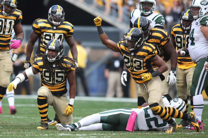
Pittsburgh Steelers' best look: 1968-96 home
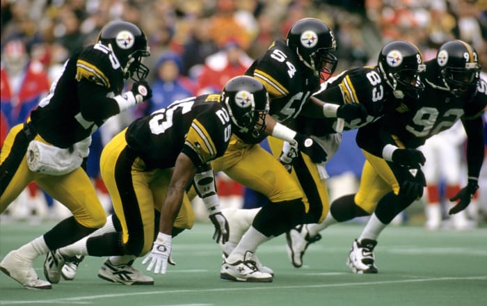
Already setting themselves apart by refusing to place a decal on both sides of their helmet, the Steelers in 1997 pushed their fashion-rebel ways to a new level by shifting to the italicized number font they use today. The pick here is Steelers Classic, used during the dynasty years and through the mid-1990s. Pittsburgh's vintage road unis should not be discounted, as they were among the best away-from-home designs, but the franchise's non-italicized black-on-gold attire — even if there is a bit of an overlap with the Iowa Hawkeyes — was an iconic look for decades.
Pittsburgh Steelers' worst look: 2012-16 home throwback
One of the better decisions in recent Steelers history: moving to a different throwback and scrapping the annual bumblebee game. Pittsburgh went to the bumblebee well a staggering six times from 2012-16. Even in the uniforms' first life, they only received one season (1933) before getting canceled. While the socks-jersey synchronization must be applauded, subjecting five 2010s Steelers teams to this fashion fate was borderline inhumane.
San Francisco 49ers' best look: 2009-present home

Hopefully this is not too edgy, but the franchise's update on 49ers Classic has proven superior to the actual version the team wore during its 1980s dynasty. These gold helmets and pants jump out more than the blander gold components of the unis Joe Montana donned. The 49ers smartly realized, as a few teams have in recent years, their transition away from their classic look (in 1996) was ill-advised. In 2009 the vintage helmet logo and less complicated fonts returned to San Francisco's equipment room.
San Francisco 49ers' worst look: 1996-97 away

But it was touch and go there for a while. The 49ers forced Steve Young and Jerry Rice to finish their storied tenures in these, changing their classic design to a trendier scheme in 1996. The look bottomed out from 1996-97. The franchise literally named for the Gold Rush abandoned gold clothing for road games, going with a white-on-white concept away from Candlestick Park in those seasons. Yes, the 49ers won a Super Bowl in 1994 using mostly throwback white-on-white away from Candlestick Park down the stretch that season; that does not make it OK.
Seattle Seahawks' best look: 1983-1999 home
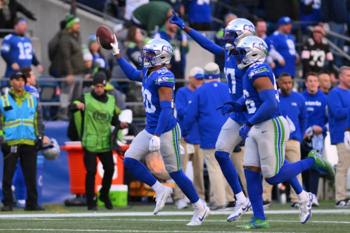
This list's original 64 choices included the 20th-century Seahawks' away white-on-gray look as superior; the team's 2023 throwback unveiling changed my mind. Perhaps the Kingdome's unflattering lighting played a part in road white being the original choice, but the Seahawks' recent commitment to best displaying their '80s and '90s home uniform brought one of this era's best throwback experiences. The wraparound Seahawk on the sleeves only existed from 1983-99, so that's the pick. The team rolling these out in its modern outdoor setting should threaten the Legion of Boom-era uniform's job security.
Seattle Seahawks' worst look: 2002-11 home
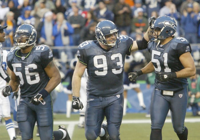
If you're looking for shade directed at the Seahawks' neon green design, this is the wrong place. That is in no way as troubling as what the franchise did in 2002. The Seahawks deserve credit for recognizing their mistake in 2012, but for 10 seasons the team subjected the masses to this ugly shade of blue. Their home attire spared no one, with it blanketing Seahawks players for most of Matt Hasselbeck's tenure. The 2002 offseason brought borderline uniform tragedies in multiple cities — Seattle and Buffalo — and it produced consequences. These Seahawks blues are also unfortunately part of Super Bowl lore.
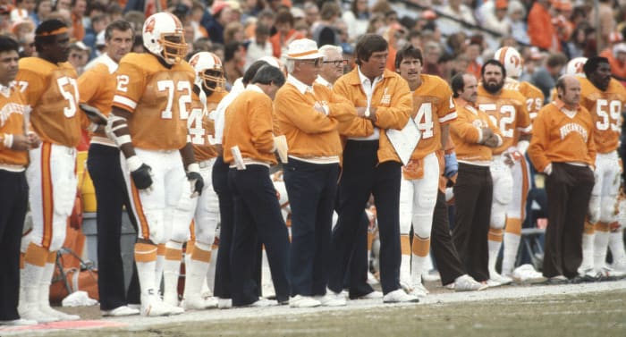
Tampa Bay Buccaneers' best look: 1976-96 home

Bucco Bruce became an unfair scapegoat for Tampa Bay futility. The 2002 Bills and Seahawks changing their schemes was a dark time, but 1997 seeing two of the NFL's orange bastions — the Bucs and Broncos — abandon classic uniforms was worse. The logo, orange facemasks and socks make this an all-time NFL look. And it was not all bad for Bucco Bruce. In between the Bucs' 2-26 start and 14 straight losing seasons in their final creamsicle years, they qualified for the 1979 NFC title game. Tom Brady wanted to wear these before he retired, but the Bucs waited an extra year — after the NFL's 2022 uniform rule change put this fashion marvel back in play — to bring these back, denying the legend that chance.
Tampa Bay Buccaneers' worst look: 2014-19 away

A tough call between Jameis Winston's former away uniform and the Bucs' present pewter-y alternate goes to the one fans were subjected to more often. This alarm clock font is bad enough, but the Bucs once stood out when they took the field. These all-white uniforms are off-putting and uninspired. While it can be said here the Bucs picked the wrong throwback uniform to revisit in 2020, their recent Super Bowl conquest notwithstanding, their Derrick Brooks-Ronde Barber color scheme at least represents a step up from what they were wearing.
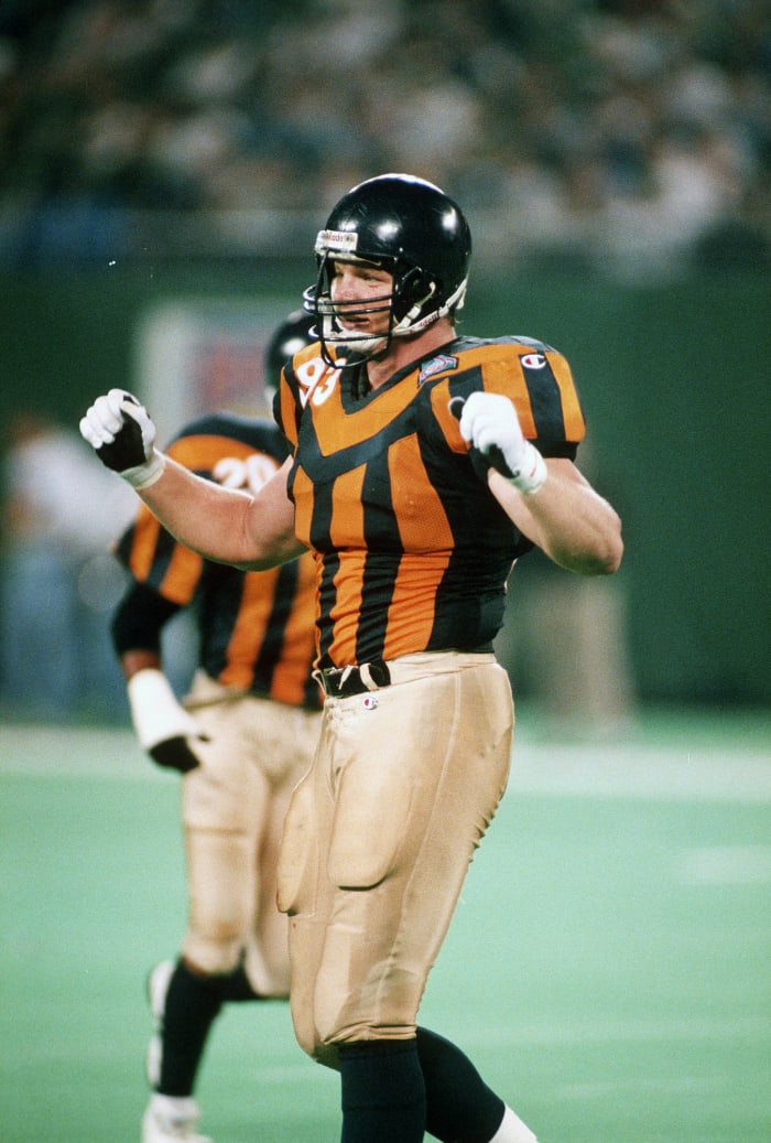
Tennessee Titans/Houston Oilers' best look: 1975-97 home

The Titans never had a shot here, with the debate being Oilers blue-on-white vs. Oilers white-on-blue. The blue jerseys were synonymous with Bum Phillips and Billy "White Shoes" Johnson in the late 1970s, Jerry Glanville's chaos in the '80s and Warren Moon's Run and Shoot in the '90s. The Astrodome was for a time a unique NFL venue, giving the home blues the edge. These marvelous light blue kits, equipped with the red facemasks and the vintage Oiler logo, shined for more than two decades.
Tennessee Titans' worst look: 1999-2017 home

The Titans unfortunately stayed with their original scheme for nearly 20 years. A steep decline from the Oilers' colors at the time, the combination of this less appealing darker blue and the shoulder stripe from a bygone era was one of the NFL's worst looks in its day. While the Music City Miracle and the Titans' lone Super Bowl appearance came in these uniforms, that does not obscure their low-level place in the NFL fashion hierarchy.
Washington best look: 1970-71 home

These uniforms lasted just two seasons, 1970-71, and the franchise had ditched them by the time it reached Super Bowl VII a year later. Washington should have thought twice about that. These red-on-yellows — complete with a far superior helmet — could have become a classic NFL uniform that lived on for decades. These, and their near-equally fantastic white-on-yellows from this time period, deserved a better fate. Washington has not worn this home uniform since, eliminating it in 1972, though its road counterpart made a one-off appearance in 2007.
Washington worst look: 2013-19 home throwback
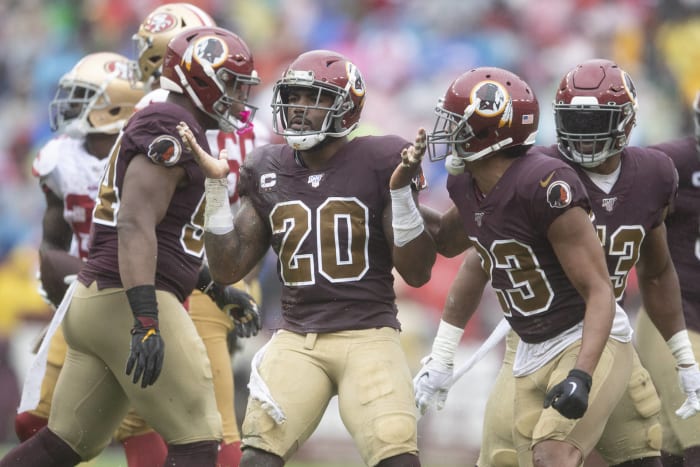
Not much of a competition here. The NFL's previous rule preventing teams from changing helmet colors left Washington wearing two different shades of burgundy. Coupled with the tan pants that were quite popular in this uniform's heyday, the design lacks redeeming qualities. It at least played a part in one of the top rain games in recent memory, in 2019's waterlogged slog against the 49ers.
Sam Robinson is a Kansas City, Mo.-based writer who mostly writes about the NFL. He has covered sports for nearly 10 years. Boxing, the Royals and Pandora stations featuring female rock protagonists are some of his go-tos. Occasionally interesting tweets @SRobinson25.
More must-reads:
- Winners and losers from Day 2 of the 2024 NFL Draft
- Eagles move up in draft to select another DB
- The '100 catches in an NFL season' quiz
Breaking News
Customize Your Newsletter
 +
+
Get the latest news and rumors, customized to your favorite sports and teams. Emailed daily. Always free!


Use of this website (including any and all parts and
components) constitutes your acceptance of these
Terms of Service and Privacy Policy.