- Home
- Quizzes
- My Quiz Activity
- Newsletters
- Sports Betting
- MY FAVORITES
- Add Sports/Teams
- SPORTS
-
NFL
- NFL Home
- Arizona Cardinals
- Atlanta Falcons
- Baltimore Ravens
- Buffalo Bills
- Carolina Panthers
- Chicago Bears
- Cincinnati Bengals
- Cleveland Browns
- Dallas Cowboys
- Denver Broncos
- Detroit Lions
- Green Bay Packers
- Houston Texans
- Indianapolis Colts
- Jacksonville Jaguars
- Kansas City Chiefs
- Las Vegas Raiders
- Los Angeles Chargers
- Los Angeles Rams
- Miami Dolphins
- Minnesota Vikings
- New England Patriots
- New Orleans Saints
- New York Jets
- New York Giants
- Philadelphia Eagles
- Pittsburgh Steelers
- San Francisco 49ers
- Seattle Seahawks
- Tampa Bay Buccaneers
- Tennessee Titans
- Washington Commanders
-
MLB
- MLB Home
- Arizona Diamondbacks
- Atlanta Braves
- Baltimore Orioles
- Boston Red Sox
- Chicago White Sox
- Chicago Cubs
- Cincinnati Reds
- Cleveland Guardians
- Colorado Rockies
- Detroit Tigers
- Houston Astros
- Kansas City Royals
- Los Angeles Angels
- Los Angeles Dodgers
- Miami Marlins
- Milwaukee Brewers
- Minnesota Twins
- New York Yankees
- New York Mets
- Oakland Athletics
- Philadelphia Phillies
- Pittsburgh Pirates
- San Diego Padres
- San Francisco Giants
- Seattle Mariners
- St. Louis Cardinals
- Tampa Bay Rays
- Texas Rangers
- Toronto Blue Jays
- Washington Nationals
-
NBA
- NBA Home
- Atlanta Hawks
- Boston Celtics
- Brooklyn Nets
- Charlotte Hornets
- Chicago Bulls
- Cleveland Cavaliers
- Dallas Mavericks
- Denver Nuggets
- Detroit Pistons
- Golden State Warriors
- Houston Rockets
- Indiana Pacers
- Los Angeles Clippers
- Los Angeles Lakers
- Memphis Grizzlies
- Miami Heat
- Milwaukee Bucks
- Minnesota Timberwolves
- New Orleans Pelicans
- New York Knicks
- Oklahoma City Thunder
- Orlando Magic
- Philadelphia 76ers
- Phoenix Suns
- Portland Trail Blazers
- Sacramento Kings
- San Antonio Spurs
- Toronto Raptors
- Utah Jazz
- Washington Wizards
-
NHL
- NHL Home
- Anaheim Ducks
- Arizona Coyotes
- Boston Bruins
- Buffalo Sabres
- Calgary Flames
- Carolina Hurricanes
- Chicago Blackhawks
- Colorado Avalanche
- Columbus Blue Jackets
- Dallas Stars
- Detroit Red Wings
- Edmonton Oilers
- Florida Panthers
- Los Angeles Kings
- Minnesota Wild
- Montreal Canadiens
- Nashville Predators
- New Jersey Devils
- New York Islanders
- New York Rangers
- Ottawa Senators
- Philadelphia Flyers
- Pittsburgh Penguins
- San Jose Sharks
- Seattle Kraken
- St. Louis Blues
- Tampa Bay Lightning
- Toronto Maple Leafs
- Vancouver Canucks
- Vegas Golden Knights
- Washington Capitals
- Winnipeg Jets
- NCAAF
- NCAAM
- Boxing
- Entertainment
- Lifestyle
- Golf
- MMA
- Soccer
- Tennis
- Wrestling
- More Sports
- RESOURCES
- My Account
- YB on Facebook
- YB on Twitter
- YB on Flipboard
- Contact Us
- Privacy Policy
- Terms of Service
-


Follow Us


The most iconic album covers of all time
When you look at the cover of an album, you should know exactly how it sounds. It may seem like an odd conundrum, but the artwork of a record can often — whether subconsciously or explicitly -— affect one's experience with the music within. Maybe it's an elaborate, commissioned piece of art. Maybe it's a photo that captures just the right kind of moment. Whatever the sleeve is, we know a great one when we see it, as it intrinsically ties our emotions to the music.
Of course an immensely popular album, while immediately recognizable, doesn't necessarily mean that its cover is legendary — just popular. Thus when it comes to listing the most iconic album covers of all time, legendary artists like Michael Jackson, for example, won't make the cut here, as his album covers are just that: extremely popular. Topics like this are meant to inspire healthy debate, so let's dive into this list of the "most iconic album covers of all time." Let's find out how they came to be and why they remain hallmarks of any music lover's collection.
Bob Dylan — "The Freewheelin' Bob Dylan" (1963)
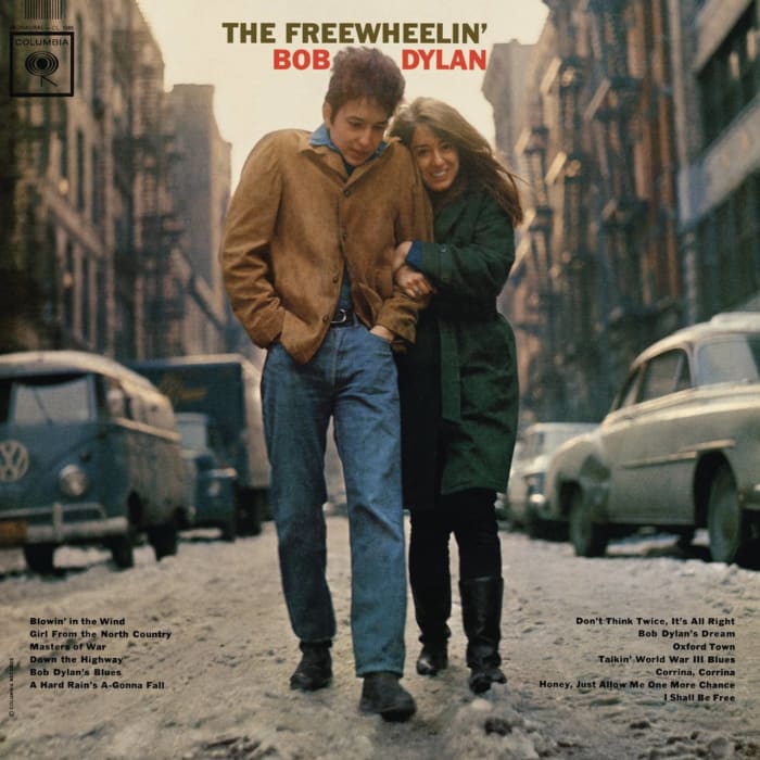
There had been great album covers prior to the release of Dylan's sophomore effort, but "The Freewheelin' Bob Dylan" ushered in a new, intimate aesthetic that was markedly different than what had come before. Here was Dylan, with then-girlfriend, Suze Rotolo, walking down the corner of Jones Street and West 4th Street in New York City's West Village during a brisk, cold day, Rotolo clutching onto Dylan's arm. Captured by staff photographer Don Hunstein, the image reveled in its casual romance, something that informed legendary songs like "Don't Think Twice, It's All Right." Of course, "Freewheelin'" is remembered for its numerous politically minded numbers, but this album cover still showed that underneath all his intellect, Bob Dylan was still a human. Even Tom Cruise and Cameron Crowe tried recreating it in their 2004 film, "Vanilla Sky," to questionable success.
The Velvet Underground — "The Velvet Underground & Nico" (1967)
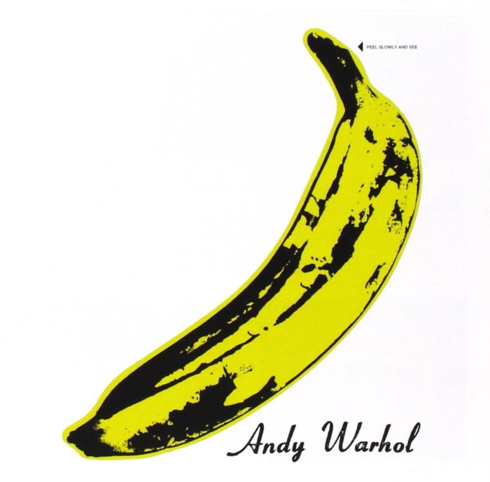
Look at that banana. Initially, The Velvet Underground — an artsy, boundary-pushing band whose chemistry anchored on the push-pull relationship between rocker Lou Reed and experimental artist John Cale — benefited greatly from the interest of mentor and "record producer" Andy Warhol. Even if Warhol's musical contributions amounted to no more than insisting German vocalist Nico be added to the lineup and then cut the check for the studio sessions, he was still one of the hottest names in pop culture at the time, so any association with him was going to be a net-positive for all parties involved. It's for this reason that the record label sprung for special printing of the phallic album cover wherein instructions were printed saying, "Peel Slowly and See." Behind that banana peel? A flesh-colored banana, which itself was yet another taboo-bursting bit of pop art courtesy of Warhol — all of which let you know that the music contained inside was just as daring as this concept.
The Beatles — "The White Album" (1968)

You could easily populate this list with numerous Beatles album covers, and one of the most iconic is the gloriously overstuffed pop art moment that was "Sgt. Pepper's Lonely Hearts Club Band," helmed by Peter Blake and Jann Haworth. While various artworks were commissioned for the band's ninth studio effort, it was Richard Hamilton who effectively convinced Paul McCartney and the rest of the fellas to pull off this daring middle-finger moment to the music world, having gone from colorful extravagance to stark, striking minimalism. With the band's name in Helvetica and ever-so-slightly off alignment, this album cover, so dismissed as a joke upon first reveal, showed that the Beatles, at the height of their powers, could truly do anything. What's more, this self-titled record (only later dubbed "The White Album" for...obvious reasons) was weirdly evocative of the music contained within. While the cover for "Sgt. Pepper's" alluded to a psychedelic panoply of songs, the blank canvas the Fab Four provided us for this epic meant that they could truly traverse into any subgenre they wanted, often inventing new ones along the way. Country? Heavy metal? Reggae? Nothing was off limits, and this cover, so deceptively simple, advertised that there were no limits to what lies beneath.
Led Zeppelin — "Led Zeppelin" (1969)

The Hindenburg disaster from 1937 remains one of humanity's more distinct tragedies, but after a joke from The Who's Keith Moon about a potential supergroup going over like "a lead zeppelin," the already iconic photo of the famed airship blowing up as taken by Sam Shere made perfect sense for the U.K. band's raucous debut effort. The design of the cover proper was done by George Hardie and remains a phallic icon of hot 'n' sweaty rock 'n' roll. Was it too perverse for some? Certainly, but it captured the fury, humor and power of Led Zeppelin's blues-inspired sound perfectly. Aristocrat and descendent Eva von Zeppelin apparently wasn't a fan, once threatening legal action over the group's name. Nowadays, anyone mentioning "Zeppelin" in conversation conjures up an image of an exploding airship and some groundbreaking rock songs to go along with it.
The Beatles — "Abbey Road" (1969)
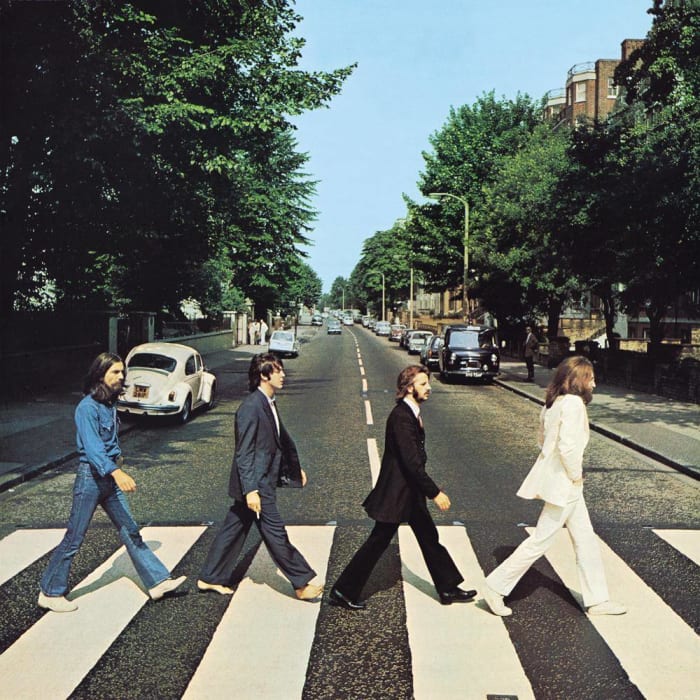
While "Sgt. Pepper's Lonely Hearts Club Band" remains a pop-art fantasia and "The White Album" was a whiplash into deliberate minimalism, there is arguably no record more instantly memorable or iconic than The Beatles' "Abbey Road." Photographed by Iain Macmillan outside the famed recording studio of the same name, this legendary cover shows the band members walking in unison but with their own identities firmly established: John with his shaggy beard and hands in his pocket, Paul strolling barefoot with a cigarette in hand, George in jeans while the rest donned Tommy Nutter suits — it all fits perfectly. It's meta in its reference to the band's internal dynamics (note how everyone is strolling with the left foot forward — save Paul), mired in artistic meaning while capturing the fashion and attitude of the era in a single, perfect moment. So often imitated but never bettered.
Captain Beefheart and his Magic Band — "Trout Mask Replica" (1969)

Captain Beefheart (Don Van Vliet) made albums before "Trout Mask Replica" and many records afterward — but this will always be the calling card. Produced by Frank Zappa, this album of clattering, atonal, experimental, and at times structure-free rock 'n' roll helped in altering the perception of what rock music could do. While Zappa always hid his clever deconstruction of form behind crass humor, Beefheart made no such apologies, rehearsing his band to sound this sloppy. There is method behind the madness, and nothing can prepare the uninitiated better than the otherworldly album cover, wherein Van Vliet is holding up a carp under his top-hatted head. Conceived of and photographed by Cal Schenkel (who worked extensively with Zappa's Straight Records, which put out "Trout Mask Replica"), this mysterious cover let listeners know that something downright alien was awaiting them between the grooves, and boy howdy: They weren't kidding.
The Rolling Stones — "Sticky Fingers" (1971)

Yep, that's what you think it is. While "Sticky Fingers" is notable for featuring the first use of the iconic "tongue and lips" logo for Rolling Stones Records (the label the band established after their contract with Decca ended), that cover image was, to many at the time, downright shocking — albeit a perfect representation of the Stones at the peak of their powers. Sleazy and intriguing at the same time, this ambitious, progressive cover was conceived by Andy Warhol, lensed by Billy Name and designed by Craig Braun. In fact, this cover was so assured to be the talk of the town that a real-life zipper was crafted onto the sleeves of the initial release. The only problem? When the vinyls laid on top of each other, the zipper was puncturing the vinyl on the album right above it. Retailers and consumers began complaining, meetings were held as to how to solve it, and then someone came up with the genius idea of...just unzipping the records before they were stacked. Transgressive at the time, the cover of "Sticky Fingers" pushed the limits of what was acceptable for record releases and, despite some protest, actually got away with it.
Nilsson — "Nilsson Schmilsson" (1971)

The power of "Nilson Schmilsson" is just how utterly, absolutely unassuming it is. From the smarmy, sarcastic album title to the fact that Harry Nilsson is just standing there in a bathrobe, staring off into the middle distance, "Nilsson Schmilsson" looks like a record that was perhaps recorded at home in a basement instead of produced by the legendary Richard Perry with full orchestrations. While the album would go on to become a Grammy-winning success with some of Nilsson's biggest and most memorable songs contained within ("Gotta Get Up,' "Coconut,' "Without You,' "Jump Into the Fire"), the cover served as a remarkable tool for disarming expectations, with Nilsson coming off as a regular guy who just so happened to be a pop music savant. To top it all off? The photo was taken by Dean Torrence of Jan & Dean fame, further connecting Nilsson to a lineage of rock 'n' roll greats.
Funkadelic — "Maggot Brain" (1971)
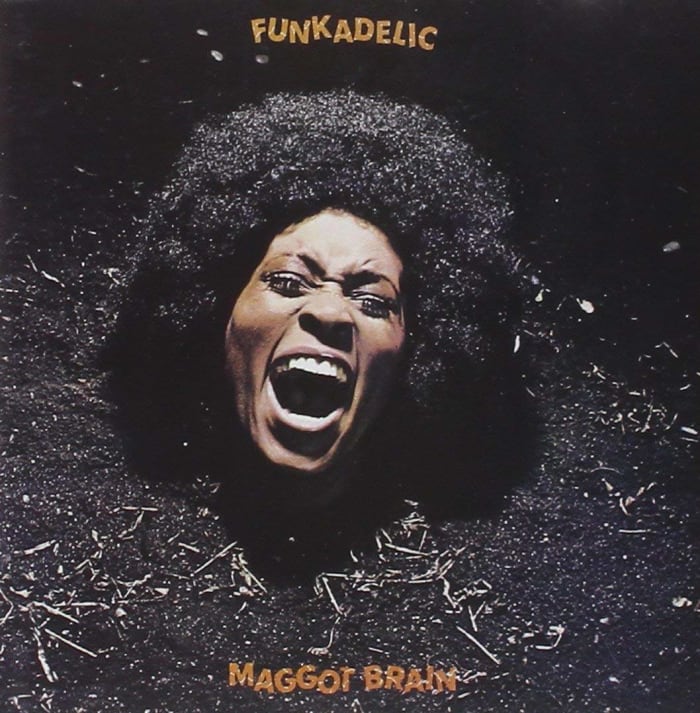
Fronting two game-changing funk groups at the same time, George Clinton's Parliament and Funkadelic each showcased different sides of his songwriting craft, with Parliament providing more genuine straight-up funk as Funkadelic added a distinctive rock edge. While Parliament was initially a bit more formal in its aspirations, a decade of psychedelic excess led to both groups putting out increasingly far-out concepts and grooves. With "Maggot Brain," Funkadelic got downright freaky, mixing wild guitar solos with ghostly monologues while still laying down some sick grooves. A casual glance at the cover shows a woman perhaps screaming in excitement, but a closer view shows model Barbara Cheeseborough buried in the ground up to her neck. The back cover? That same patch of ground but now with a skull in its place. Proving that the band was willing to go to dark extremes where it needed to, "Maggot Brain" nonetheless was a revolutionary record with a daring cover to boot.
David Bowie — "Aladdin Sane" (1973)

David Bowie put out albums far better than his sixth studio effort, "Aladdin Sane," but none of them was coupled with an image so instantly recognizable as the album cover. Photographed by Brian Duffy, the painted lightning bolt across Bowie's face was meant to represent his concept of schizophrenia, which plays into the record's punny title (i.e. "a lad insane"). Recorded just before he went into a deep period of heavy drug use, that lightning bolt soon became Bowie's de facto trademark, and when you hear the words "David Bowie," it's often the first image that comes up. While the lightning bolt and downcast gaze are what's most remembered, those odd little details of the teardrops pooling in his collarbone and blasted-white chest area add just that additional bit of weirdness to what would soon become known as de facto Bowie.
Pink Floyd — "Dark Side of the Moon" (1973)
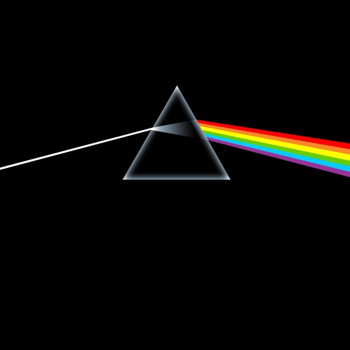
One can't talk about iconic album covers without talking about Pink Floyd, and if we're talking about Pink Floyd, we're talking about Storm Thorgerson. For the uninitiated, Thorgerson had his hand in record covers that were both eye-catching and unapologetically Thorgerson. While he is known for doing the designs for Peter Gabriel's early solo LPs, Ween's "The Mollusk" and artists like Paul McCartney, Led Zeppelin, The Mars Volta and Genesis, he is still best known and remembered as the man who gave Pink Floyd its distinct visual identity. While Thorgerson and Aubrey Powell (who later formed the design firm Hipgnosis) had been long-standing Floyd collaborators, the band insisted that something "simple" be done for its eighth LP, "The Dark Side of the Moon." Initially frustrated but soon later overcoming the challenge, the simple prism graphic conceived of for the cover told you everything you needed to know about the psychedelic experience waiting for you inside. It's simple to the point of genius and helped color the perceptions of the tens of millions of people who bought it, eventually going down as one of the best-selling records of all time.
Joni Mitchell — "Hejira" (1976)
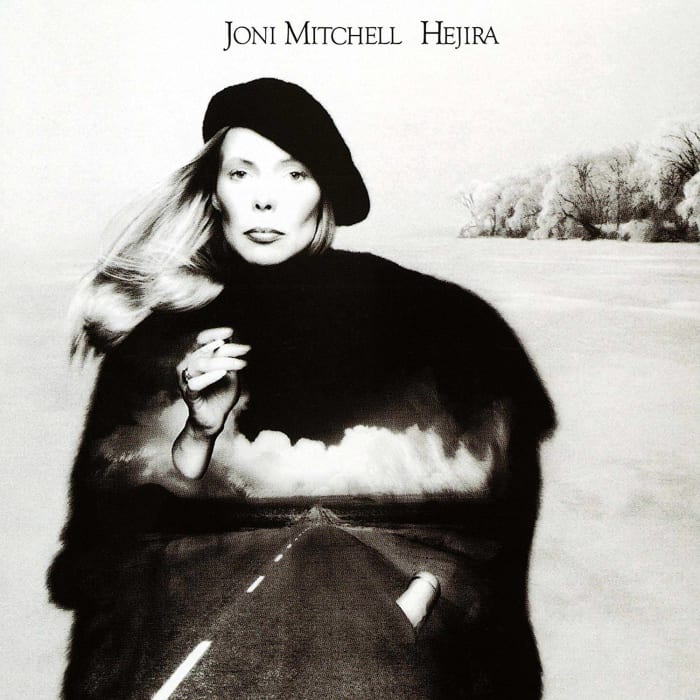
Joni Mitchell's discography is littered with classic albums, with 1971's "Blue" and 1974's "Court and Spark" frequently coming to mind upon first mention. Yet as the '70s bore on, Mitchell became increasingly fascinated with jazz and began integrating it to her sound to varying degrees of commercial and critical success. "Hejira," her eighth studio album, remains an accessible, fascinating journey into her changing aesthetic, anchored by great songs like the single "Coyote" and one of her all-time best album tracks with "Furry Sings the Blues." Yet this album cover is the best of her entire career, hands down. Photographed by industry veteran Norman Seeff (who snagged shots of everyone from The Rolling Stones to James Taylor to Rufus & Chaka Khan), "Hejira" shows Mitchell with a beret on her head and a cigarette in her hand, a lonesome road projected across her body while she is imprinted onto an image of a snowstorm-struck country field (which in real life is Lake Mendota in Madison, Wisconsin). Elegant, evocative and beautiful, this is arguably one of the first images that comes to mind when you think of Joni Mitchell — and for good reason.
Steely Dan — "Aja" (1977)
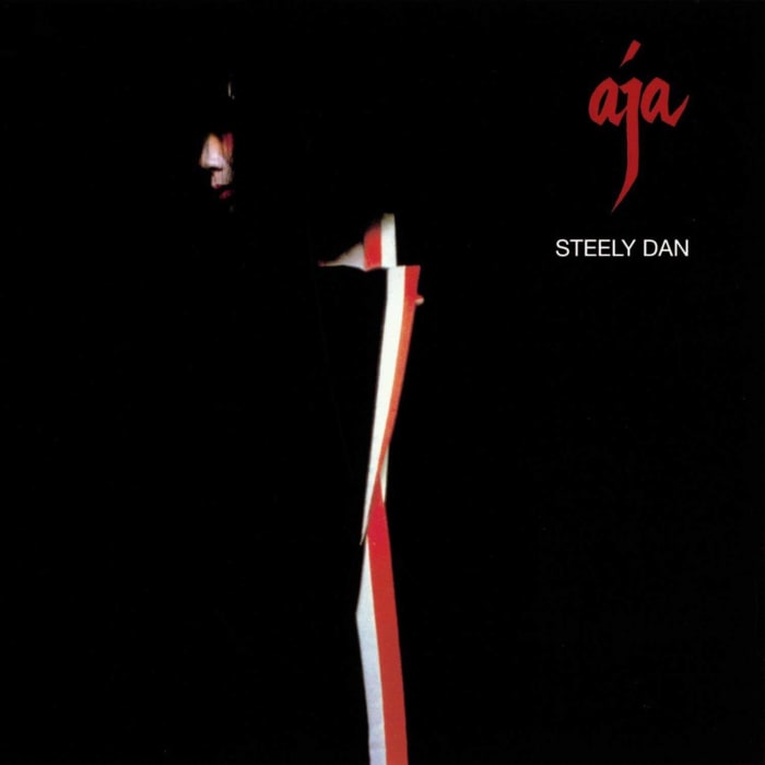
Walter Becker and Donald Fagen were no strangers to distinctive album sleeves, from the charming nostalgia of "Pretzel Logic" to the pop art explosion that is their debut effort, "Can't Buy a Thrill." Yet when the boys fully committed to jazz fusion for "Aja," it ended up serving as their calling card. Primarily black with careful hints of white and red, photographer Hideki Fujii caught model Sayoko Yamaguchi in a variety of poses, but the white and red hints on her garment in the take chosen for the album art provides a distinct, striking symmetry. Advertisements at the time referred to "Aja" as "a place in your mind," and when you glance at the cover of the record proper, it's hard to not to be transported there.
The Clash — "London Calling" (1979)

"London Calling" is unquestionably The Clash's masterpiece: a sprawling punk record that was unafraid to address societal ills while also flexing and stretching the boys' skills in a variety of genres. The sheer power and fury of their energy is captured perfectly on the album cover, where bassist Paul Simonon is seen smashing his guitar right on stage. Photographer Pennie Smith initially thought the image was too out of focus to be considered usable, but Joe Strummer and designer Ray Lowry disagreed. As for the big colorful lettering? It's a deliberate and winking homage to Elvis Presley's 1956 debut effort, which used the exact same aesthetic. Nodding to rock's storied past while rewriting its future in the same stroke? That adds up to a genius album cover if we've ever seen one.
Joy Division — "Unknown Pleasures" (1979)

As the de facto "post-punk" album, Joy Division's debut effort, "Unknown Pleasures," is a dark, sinewy record built around the band's tight musicianship and Ian Curtis' pained, disconnected vocals. The group's visual aesthetic would always lean toward the simple and evocative, but the cover for "Unknown Pleasures" has arguably outgrown the band's musical legacy, frequently referenced, imitated and parodied, even if casual fans know the group only for penning "Love Will Tear Us Apart" — a non-album single. "Unknown Pleasures" remains a stunning, brooding masterpiece, and the cover is a pristine glimpse into the band's musical worldview. It was created by artist Peter Saville, who previously designed a lot of posters for the Factory, the legendary club in Manchester. The audio waves depicted are radio waves from a pulsar, and given that "Unknown Pleasures" itself sounds cold and alienating, there couldn't have been a better aesthetic fit.
Minor Threat — "Minor Threat" (1981)

You may not think of it as much at first glance, but the photo of Minor Threat's debut EP (and later recolored for a full-length 1984 compilation of the same name) was a quiet revolution. The lonely skinhead, head down and fully distancing himself from the world around him while sitting on a stair helped showcase that even among the hardcore punk rockers, anyone could be vulnerable. It was remarkably humanizing given the thundering pound of the Ian MacKaye songs contained within, but it immediately set the D.C. band apart from its peers. Over the years, this album cover would be imitated (by Rancid, no less) and ripped off by many others, but the original photograph proved to be profoundly disarming, helping put the D.C. hardcore scene on the map in short order.
Bruce Springsteen — "Born in the U.S.A." (1984)

In a 2009 interview with Rolling Stone, Bruce Springsteen revealed why his butt graces the cover of his most popular album: "We took a lot of different types of pictures, and in the end, the picture of my [rear end] looked better than the picture of my face; that's what went on the cover." While Springsteen has always been associated as a man who wrote anthems for the working class, this photograph, wonderfully captured by Annie Leibovitz, showed Springsteen in blue jeans with a baseball cap stuffed in his back pocket, all while standing in front of the bars of an American flag. Perhaps unintentionally nodding as the exact inverse of the Rolling Stones' "Sticky Fingers," this denim-clad posterior was simply leading you to Springsteen's most considered and popular record, representing the fact that you might already look the part of someone living the American dream.
The Smiths — "The Queen is Dead" (1986)

Morrissey has always been one to wear his pretentious right on his sleeve, as while that was initially part of his charm and intrigue, it has, over the years, been one of his more divisive attributes. Yet his love of literature and classic films helped color in the covers of all the albums for The Smiths, and for "The Queen is Dead," their arguable high point, Morrissey found a still from the 1964 film "L'Insoumis" with actress Alain Delon that proved to be generation-defining. For a record that finds splendor in the fatalistic side of romance, Delon's pose, reclined and utterly forlorn, came to embody the band's image and aesthetic near perfectly.
N.W.A. — "Straight Outta Compton" (1988)

For N.W.A.'s powerhouse debut album, the cover was just as provocative as its moniker. Photographed by Eric Poppleton, the shot shows you, the viewer, laying at the pavement, staring up at the sky, the group gathered around you and Eazy-E shoving a gun in your face. It's dramatic and intimidating and a perfect encapsulation of N.W.A.'s entire worldview. One of the most pivotal records of the gangster rap movement, N.W.A. didn't come here to play.
De La Soul — "3 Feet High and Rising" (1989)

Debuting just a year after "Straight Outta Compton", De La Soul's debut album completely rewrote the rulebook on what rap music was capable of, strolling past gangster rap's braggadocio and giving the world a taste of hip-hop that was optimistic, goofy and often catchy and entertaining. The sudden success of the record — as well as the backlash from those who had grown accustomed to a certain level of grittiness in their rap records -— led De La Soul to retreat on its sophomore effort (literally called "De La Soul is Dead"), but "3 Feet High and Rising" remains a joyous, game-changing full-length. This bright and colorful optimism is perfectly reflected in its cover, wherein the group's adherence to being a part of "The D.A.I.S.Y. Age" (aka Da Inner Sound, Y'all) was represented by the British design collectively known as the Grey Organisation. With colorful flower patterns and a highlighter-yellow background, the cover of "3 Feet High and Rising" absolutely captures the feeling of listening to the album, with Prince Paul's nerdy and clever cut-and-paste samples changing the way rap records were produced. Plus, in a world of rap records with gritty street tones, this cover popped out of record racks like a lighthouse during a hurricane. De La Soul may be dead, but The D.A.I.S.Y. Age lives on.
My Bloody Valentine — "Loveless" (1991)

We stated that an album cover should give you a crystal clear idea of what the music sounds like inside. This is taken to literal extremes for My Bloody Valentine's sublime shoegaze masterpiece "Loveless," which symbolizes everything great about "swirling guitars." For those unfamiliar with the record, waves upon waves of guitar feedback are transgressively mixed and distorted into new melodic shapes, creating an all-encompassing aural experience. Photographed by Angus Cameron, "Loveless" shows a guitar out of focus, perhaps being played furiously, with a fuzzy pinkish-red haze effect glossing over the whole image. It seems chaotic, but it's more about the "idea" of what a guitar sounds like than showing something basic like six-strings ringing mid-strum. This is effectively what the album does, distorting everything we know about what sonics an amplified guitar should create. Perhaps the cover wouldn't have had the same impact had the album not have turned into the cult classic that it was. But now looking back, could there have been any more fitting an image?
Nirvana — "Nevermind" (1991)

In some ways, the cover for "Nevermind" is kind of obvious: A baby is swimming toward a dollar on a fishing hook. Although this dig toward the more materialistic-minded aspects of capitalism may come off as simple to some, it certainly didn't come off as simple to any of the millions of people who ended up buying this album. Given that "Nevermind" (in tandem with Pearl Jam's "Ten") is considered ground zero for the modern grunge movement, the way this sleeve acknowledges how we all buy in to the rat race and are victims of it at the same time genuinely resonated with people and helped color in Kurt Cobain's lyrics about alienation surprisingly well. Conceived of by Cobain and Geffen Record's art director Robert Fisher (and photographed by Kirk Weddle), "Nevermind" went on to become a generational touchstone, and for good reason.
A Tribe Called Quest — The Low-End Theory (1991)

A Tribe Called Quest embodied everything great about "alternative hip-hop": Its beats, melodies and wordplay were all top tier, but the group never leaned so far into hippy-optimism of De La Soul so as to alienate a more traditional hip-hop purchasing audience. They found a sweet line of playfulness and authenticity that never let them down. As time went on, the group got increasingly more interested in serious fare, leaning more and more into jazz-based samples to deepen their sound. All of this came to a head on the sophomore effort, "The Low End Theory," which remains its debatable masterpiece. The red-and-green striped woman — a model who was painted in glow-in-the-dark paints specifically for this shoot — was conceived of by Jean Kelly, although it's been reported that other takes exist where there was more green on her body, and she ended up looking like a zucchini. So powerful was this image of her reclined in the darkness that she soon would become the semi-official mascot of the group, reappearing on other covers and in promotional material — even if this first striking impact can truly never be bettered.
Green Day — "Dookie" (1994)
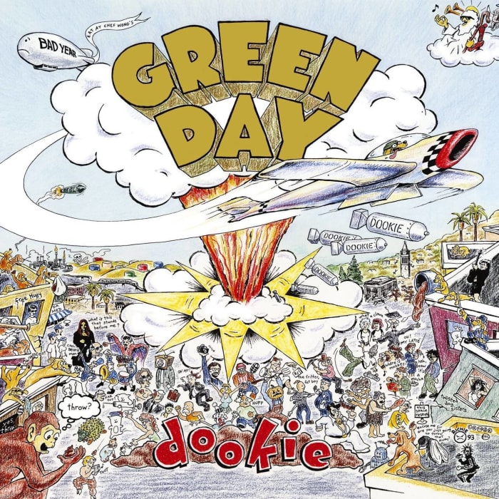
Unfortunately for Richie Bucher, the band fronted by his girlfriend, Courtney and the Crushers, never really took off. He was, however, asked to come up with the artwork for "Dookie," the third full-length album from pop-punkers Green Day. Crass and clever in equal measures, monkeys and dogs are throwing poo at various celebrities across Berkeley's Telegraph Avenue, with a jet pilot doggo pulling focus by dropping "Dookie Bombs" (which, for those who don't know, is a slant-reference to diarrhea). Chaotic and colorful, this drawing represents everything you need to know about Green Day: raw, immature, pop culture aware and energetic. One can argue that Billie Joe Armstrong's songwriting is more intellectual and nuanced than the cover would let on, and you would be absolutely right. Yet Green Day are punk rockers at heart, and this cover spoke to an entire generation raised on junk TV and sarcasm. If you were to predict then that Green Day would only get better from here on out, well you might just be a basket case.
The Black Crowes — "Amorica" (1994)
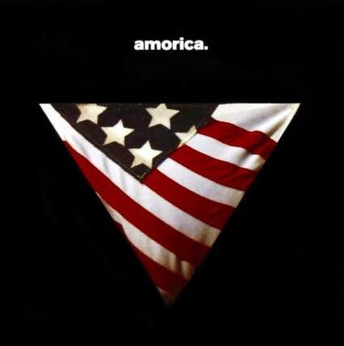
While "Amorica" is a good Black Crowes record — perhaps even their best, although assuredly not their most popular — there is no distinguishable musical legacy this album has left. That's OK though because the album art is a completely different story. Not everyone can be Death Grips and simply put an engorged member on their album, because a lot of sexuality doesn't deal with nudity so much as the "hint" of nudity: the buildup, the tease. Thus, when an album doesn't explicitly show genitalia but hints at what could be, that pushes the public debate into what is and is not acceptable for public consumption. For "Amorica," the band pulled an image from a 1976 issue of Hustler Magazine showing a model in an American flag thong with a hint of pubic hair sticking out over the top. (The original image can be seen here). Many retail outlets flat out refused to carry the record due to this image, at least until it was modified to show only the triangle thong with the rest of the background coated in black, shown here. There have been controversial album covers before, but "Amorica" pushed boundaries in truly unforgettable ways.
The Smashing Pumpkins — "Mellon Collie and the Infinite Sadness" (1995)

Starting out as a band as equally obsessed with grunge as it was with dream-pop, The Smashing Pumpkins made such gigantic artistic leaps between albums that some fans had a hard time keeping up. Following up the alternative-rock smash album "Siamese Dream" would be no easy feat, and Billy Corgan and Co. did so with the sprawling, overambitious double album "Mellon Collie and the Infinite Sadness." Indulgent to a fault, the Pumpkins fit every style they could into this grand multi-disc release, ranging from their darkest hard rockers to some campfire singalongs to orchestral triumphs. For a record this opulent, there needs to be a cover to fit, and thankfully for the Pumpkins, collage artist John Craig managed to come through, turning Corgan's crude faxed sketches into a compelling cover inspired by early 20th-century futurism and fashion. The star girl concept later informed the band's genius music video for the single "Tonight, Tonight" (which was an explicit recreation of the 1902 Georges Méliès standard "A Trip to the Moon") and still remains the artistic aesthetic most closely associated with the group.
Aphex Twin — "Richard D. James Album" (1996)

Given that Aphex Twin's early albums were "Selected Ambient Works," some fans were surely caught off guard with Richard D. James' fourth album titled... "Richard D. James Album." Although drum 'n' bass aesthetics had been a part of his midtempo creations before, this marked his turning point when he began embracing "drill 'n' bass" as an aesthetic goal, merging quick programmed beats with aggressive, industrial tones and timing, something that became fully realized on his 1997 nightmare-inducing single "Come to Daddy." While "Richard D. James" album is full of pleasant and melodic moments, his darker side begins emerging here, realized to its fullest extent with its unbelievably creepy cover. Shot and manipulated by James himself (although he credits Johnny Clayton as well, despite Clayton saying all he did was teach James how to use Photoshop), that cruel, devious smile would soon inform the most popular of James' output, especially in the form of his Chris Cunningham-directed music videos for "Come to Daddy" and "Windowlicker." No matter how you look at it, this cover still haunts our dreams.
DJ Shadow — "Endtroducing...." (1996)
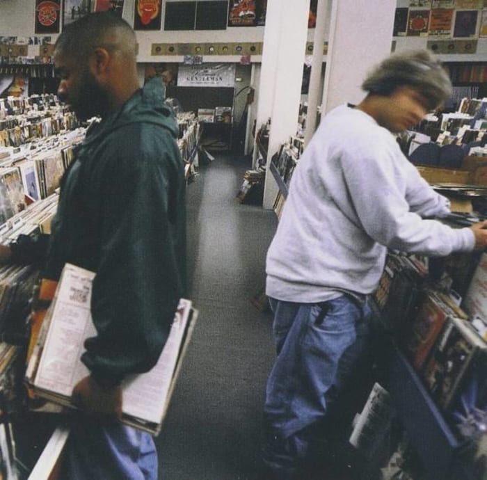
DJ Shadow's debut full length is a journey. With an unbelievably nuanced taste, the man behind the moniker, Josh Davis, grabs drum beats from one record, forgotten stand up comedy routines from another, various horn riffs and smashes it all together in artful compositions that sound just as fresh today as when they did in 1996. He was a "crate-digger," gathering up rare and obscure vinyls for fresh inspiration. Thus, it made sense that for the cover of "Endtroducing....," a record store would be represented. Shot by B+ (aka Brian Cross), a multi-hour digging session at the now-closed Rare Records with Shadow's friends Chief Xcel and Lyrics Born resulted in this quietly unassuming cover, with vinyls as far as the aisle can see but no single cover standing out amid the rows upon rows of them. Instead, two figures are searching for tunes, one turning toward the camera in mid-motion, and — that's the moment. Vinyl shopping is an especially fitting aesthetic given that this album sounds both innately familiar and completely alien at the same time: We've heard these sounds before but just not in the same way. Surprisingly perfect.
Beck — "Odelay" (1996)

What an incredible image this cover is. Beck has a long history of astounding sleeves (outside of when he gets serious and puts his face on the cover), like with 2006's "The Information" where he provided stickers and a sheet of graph paper for you to make your own sleeves. Yet "Odelay" takes the cake, as Beck's genre-hopping whimsy was arguably never better than on this alternative radio goldmine. Allegedly, it was Beck's girlfriend at the time who stumbled across this image, a shot of the hairy Komondor dog breed taken by Joan Ludwig for the American Kennel Club's magazine. It is whimsy in motion and just the kind of niche obscura item that helped define much of the smarmy mid-'90s alternative rock scene.
Neutral Milk Hotel — "In the Aeroplane Over the Sea" (1998)

Greeted with good-to-great reviews when it first came out, Jeff Magnum's magnum opus under his Neutral Milk Hotel moniker has slowly become one of the defining indie rock albums for a generation, with new legions of college radio listeners discovering it and passing it on down like a treasured story. While Magnum himself remains shrouded in mystery (to date, he hasn't put out another album), much allure can be traced back to this striking cover, where a woman's head has been replaced with a drum. Originating from a European postcard discovered by Magnum, the design was fleshed out by Chris Bilheimer. Nostalgic and strange, disquieting yet memorable, the sleeve for "In the Aeroplane Over the Sea" has become much more than just a calling card for Neutral Milk Hotel, now embodying an entire indie rock template unto itself.
Blink-182 — "Enema of the State" (1999)

Much like Green Day before them, there was a lot of giddy numbers on Blink-182's punk-pop breakthrough, many of them becoming radio staples in quick order. So while the deliberate and suggestive cover for "Enema of the State" achieves exactly the kind of titillation it was aiming for, it's striking just how lionized this goofy sleeve has become. Shot by David Goldman and featuring adult film star Janine Lindemulder as the nurse (the working album titled was going to be "Turn Your Head and Cough"), "Enema of the State" told you everything you needed to know about the band upfront: It was cheeky, had a largely white male fan base, and didn't take itself — or anything, really — all that seriously. The band showcased occasional glimpses of real gravitas during its imperial period ("Adam's Song" and "Stay Together for the Kids," specifically), but it was a perfect storm of elements that came together to help make "Enema of the State" the legendary cover that it is today.
The Roots — "Things Fall Apart" (1999)
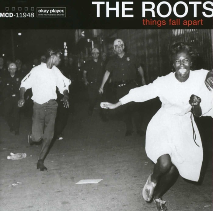
The Roots has always been a great band, but to many, 1999's somber and politically charged "Things Fall Apart" was its first true masterpiece. From the tight rhythms to Black Thought's bouncing, considered flow, it felt like the band that everyone already loved was coming together to say something important. This considered approach can be seen in the expertly selected cover art, wherein two black teenagers are fleeing from white riot police in the 1960s. Unlike most of the entries on this list, the original photographer's identity has been lost to time but Kenny Gravillis served as art director, while the photo was obtained from the licensing storehouse Corbis. The look of fear on the girl's face as she runs past the photographer is heart-wrenching and gives an immediate emotional focal point for the songs that follow. Harrowing and humbling, The Roots made a bold move with this cover and it has rightly been recognized as a classic since its release.
Sigur Rós — "Ágætis Byrjun" (1999)

For their sophomore album, Sigur Rós had a "go big or go home" moment, moving past the more electronically minded instrumentals of its debut album, "Von," into something much deeper and emotional. The songs got longer, the instrumental palette had more texture and depth and Jonsi's lyrics, sometimes sung in Icelandic and sometimes in a nonsense language, hit upon themes of a sort of "rebirth." Thus, when it came to getting an album cover, artist Gotti Bernhöft got out his pen and did what would be several revised sketches of an angel fetus. Eventually, the image of the fetus holding his umbilical cord between clasped prayer hands was selected, and it captured the joyous, hopeful sound of "Ágætis Byrjun" perfectly.
OutKast — "Stankonia" (2000)
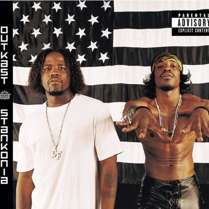
Deceptively simple, the cover to OutKast's "Stankonia" features Big Boi and André 3000 posing in front of a black-and-white American flag. From here much symbolism can be derived: Do they think that the American dream is dead? Are they saying that there's a separate America for black people? Or is this to be perceived as a potential representation of Stankonia itself, the fictional world that OutKast is speaking of on this album? It's hard to say for sure, but seeing the duo with their clearly defined individual styles together makes for one hell of an invitation to visit "Stankonia" time and time again. Lensed by Michael Lavine, "Stankonia" joins a long line of great OutKast sleeves, and, outside of a greatest hits compilation, this was sadly the last time they shared a cover photo together; every record since then was merely a composite of the two in different setups, together but clearly apart.
Deftones — "White Pony" (2000)

Deftones always played around with the nu-metal kids but never quite fit in. There was an artsy fatalism to Chino Moreno's lyrics that coupled well with the band's dark, drawn-out song structures, all of this coming to the forefront on its best album, "White Pony." Tracks like "Digital Bath" and "Knife Prty" were nervy, unsettling affairs, and when mixed with hypnotic imagery of lead single, "Change (In the House of Flies)", it all makes for a well-managed nightmare. As white pony is slang for cocaine (and, according to Moreno, apparently a specific sex euphemism), it would only be fitting that a white pony is on the cover. The band was apparently inspired by Hum's 1995 effort "You'd Prefer an Astronaut," which featured a zebra standing in front of a plain green backdrop. Designed by Frank Maddocks, the so-obvious-it's-brilliant aesthetic of "White Pony" absolutely made Deftones stand out in a crowded field of angsty rockers, and to this day, it's often cited as their crowning achievement.
Madvillain — "Madvillainy" (2004)

MF Doom has been hanging behind his signature Doctor Doom mask for years. It never leaves his face and appears in a large majority of his album art. Yet the stare he gives out of it for the cover of "Madvillainy" — his hit album-length collaboration with legendary producer Madlib — is something else entirely. Behind the mask is pain, intention and other intangible emotions that beg further explanation. Conceived of by Stones Throw Records' Jeff Jank and photographed by Eric Coleman, the cover feels like the definitive iteration of Doom's aesthetic, capturing Doom at the absolute peak of his powers and popularity. The two would never make another full-length together (the 2008 "Madvillainy 2" release is merely a remix effort), but we never needed one, as "Madvillainy" is a perfect distillation of everything great about backpack rap.
Lil' Wayne — "Tha Carter III" (2008)

To be fair, the "rapper as child" aesthetic has been used before, most famously with the infant on the cover of The Notorious B.I.G.'s iconic debut outing from 1994, "Ready to Die" (although special shout-out to Nas' "Illmatic," which came out the same year). Yet when the photo of an infant Lil' Wayne with his present-day face tattoos began circulating online, people were hopeful that this would be the album cover — and 'lo and behold it was. Comical and oddly poignant in the way it suggests that Wayne has never changed, the sleeve was deemed an instant classic and showed that for all his braggadocio, Lil' Wayne's playful side remained fully intact. This photo became so memorable that it was even imitated, quite bizarrely, on One Directioner Zayn Malik's 2016 solo debut, "Mind of Mine." Sorry Zayn: Wayne wins this one by a milli.
Run the Jewels — "Run the Jewels 2" (2014)
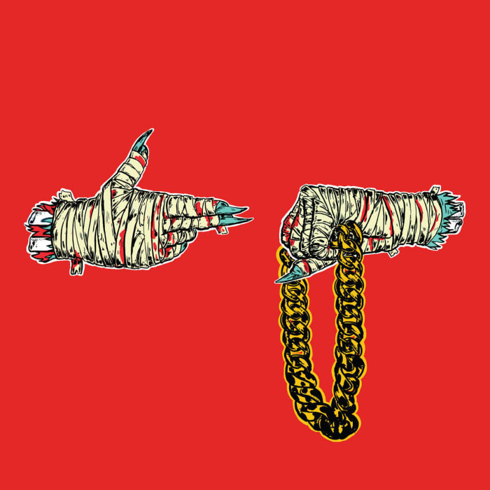
El-P has been one of the underground's greatest rapper-producers for several years running, and the opening slate of releases from his legendary (and now defunct) Definitive Jux imprint helped launch the careers of Aesop Rock and Mr. Lif, to say nothing of his work bringing Cannibal Ox's "The Cold Vein" to life. Yet his work with Dungeon Family member Killer Mike has been nothing short of a tour de force, with the two playing off each other with wit, charm and absolute ferocity. The name Run the Jewels has been given a simple two-hand gesture, with one hand holding the jewels and the other in the shape of a gun, telling you everything you need to know about the duo's sense of urgency. This gesture has so far been the staple of the guys' three albums, the aesthetic slightly changing with each one even as their popularity grows. Finger gun to our head, our favorite would be the iteration on their second full-length (artwork by Nick Gazin), where the backdrop is a sharp red, the hands are wrapped up like mummys, and the duo's sense of immediacy can be instantly felt.
Kendrick Lamar — "To Pimp a Butterfly" (2015)
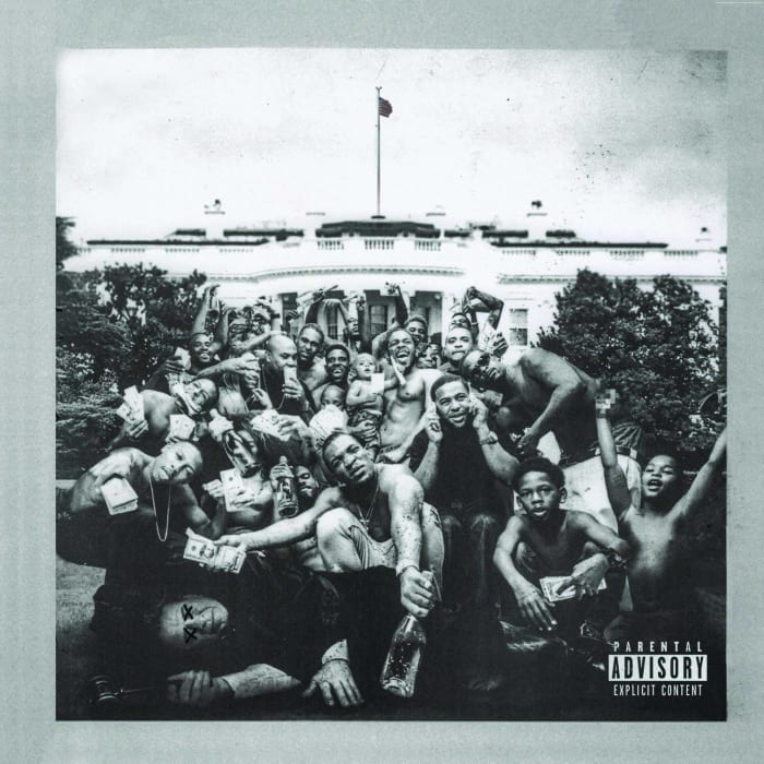
At this point in his career, a Kendrick Lamar album is an event, and "To Pimp a Butterfly" — his third studio album proper — came in on waves of astronomical hype, becoming an instant classic the second it landed. Raw, convoluted, alienating and progressive, Lamar packs a litany of concepts about the black experience into this dense, powerful record, holding an imaginary conversation with Tupac Shakur and even bum-rushing his own lead single just to throw listeners off their groove. His cover art, photographed by Denis Rouvre under direction from the higher-ups at Top Dawg Entertainment, was designed to show black empowerment while also terrorizing white America, with guys slinging cash and booze around on the White House lawn as a dead judge lays before them. The image was meant to be provocative, but it's also not without its humor (check the guy speaking on two cell phones at once front and center), proving that Kendrick has distinct creative layers, tackling a variety of topics in an even wider variety of tones. The hype at the time was overwhelming, so it has ended up a pleasant surprise that the resulting album — music, cover, and everything else — lived up to impossible expectations.
Beyoncé — "Lemonade" (2016)
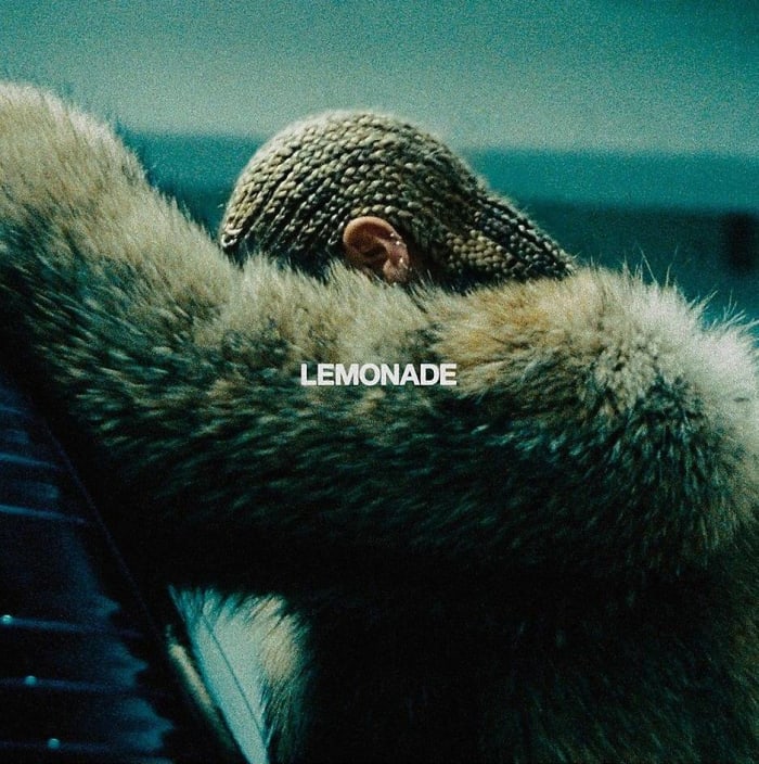
While Beyoncé's artistic rebirth started with 2011's excellent "4" and carried over on her surprise-released visual album "Beyoncé" in late 2013 (which, with a black background and her lettered name, proved quite the statement), "Lemonade" was a force unto itself, reframing the conversation about her husband's transgressions while also addressing a woman's role in the modern America. From "Sorry" to "Formation" to the fiery "Freedom," Beyoncé was firing on all cylinders for this record, and her cover shot helped add to her allure. A press shot captured during the "Don't Hurt Yourself" video shoot, it shows Beyoncé with her hands against a car, her hair in cornrows, looking down at something while donning a fur coat. This one simple image contains layers of modern black identity, while her downward gaze makes us question what her motives are. Is she concentrating? Is she remorseful? Is she trying to calm herself? Beyoncé, ever the secret-keeper, hasn't been forthcoming as to what her interpretation of the record is, but even a handful of years after the fact, we're still wondering and admiring all the same.
Evan Sawdey is the Interviews Editor at PopMatters and is the host of The Chartographers, a music-ranking podcast for pop music nerds. He lives in Chicago with his wonderful husband and can be found on Twitter at @SawdEye.
More must-reads:
Trending in Entertainment
Customize Your Newsletter
 +
+
Get the latest news and rumors, customized to your favorite sports and teams. Emailed daily. Always free!


Use of this website (including any and all parts and
components) constitutes your acceptance of these
Terms of Service and Privacy Policy.